| Author | Thread |
|
|
03/09/2004 03:55:52 PM |
| I think its wonderful. Every aspect of it...! |
|
|
|
03/04/2004 03:50:27 AM |
| Way to go Yanik. Your bed shots are becoming a trade mark of yours :) |
|
|
|
03/03/2004 08:24:35 PM |
| This was my vote for the best of the bunch. Great idea, great composition, great lighting, GREAT PHOTO. Congrats on the ribbon. I can only hope one of my photos can inspire someone like this has me. |
|
|
|
03/03/2004 01:22:01 PM |
This picture will give me a lot to reflect upon in the coming days. When I first looked at this image it didn't really appeal to me. I didn't relate to it. Lots of other people have looked at this picture and thought it to be great.
Today I reflect upon thoughts that maybe if I had spent another 30 seconds, would I have scored it higher. Given the very close finish between the top 3 pictures I feel partially responsible for the possibility of this picture not doing even better.
Enough of my personal issues..
Congrats on finishing in the top 3, well deserved and nicely done. |
|
|
|
03/03/2004 12:52:42 PM |
Congratulations, Yanik! Nobody does this kind of picture better than you - I love it.
PS - I moved to BC at the end of January. I miss Ottawa (but I'll be back to visit, two of my children are at university there). Take care,
Ursula |
|
|
|
03/03/2004 12:30:43 PM |
| i loved it the second i saw it...i have it in my favorites. |
|
|
|
03/03/2004 12:27:28 PM |
|
|
|
03/03/2004 10:20:30 AM |
| Congratulations on the ribbon - wonderfully lit and a nice message. |
|
|
|
03/03/2004 09:25:28 AM |
| Something most of us can relate to! Congratulations on the ribbon! |
|
|
|
03/03/2004 08:29:35 AM |
Very simple but so well done.
Congratulations.
Gordon |
|
|
|
03/03/2004 05:10:37 AM |
| Simply great concept and lighting |
|
|
|
03/03/2004 12:44:07 AM |
| congrats! excellent lighting and composition! |
|
|
|
03/03/2004 12:31:59 AM |
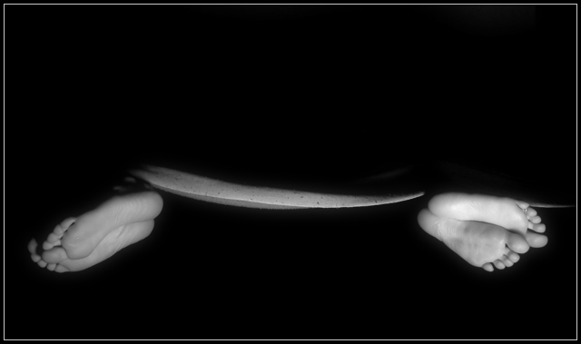
You da man Yanik. how come most of your ribbon shots include two people in a bed? ;)
Pedro |
|
Comments Made During the Challenge  |
|
|
03/02/2004 09:23:39 AM |
| who HASN'T been there??? nice shot |
|
|
|
03/02/2004 05:47:52 AM |
| A bit too dark, but an excellent and creative idea. |
|
|
|
03/02/2004 12:19:19 AM |
| Great idea, nice shot. Simple and yet powerful. Congratulations. |
|
|
|
03/01/2004 12:11:01 PM |
| Inspired idea. Good representation of conflict. |
|
|
|
03/01/2004 04:04:23 AM |
| Well done. Very creative. |
|
|
|
02/29/2004 05:07:17 PM |
|
|
|
02/29/2004 01:28:31 AM |
|
|
|
02/28/2004 03:53:11 PM |
| Good idea, and nice composition, too. My favorite of the bunch. 9 |
|
|
|
02/28/2004 03:47:00 PM |
| Very good work. Simple and effective. |
|
|
|
02/28/2004 03:44:15 PM |
| Well done, and funny photo. It has great aesthetics as is, but I think it would have been fine to see the blanket better. What you can see of the blanket looks a bit strange here. |
|
|
|
02/28/2004 01:02:23 AM |
| very creative, nicely composed, and such cute toesies! |
|
|
|
02/27/2004 08:03:57 PM |
I like the idea a lot. B&W works really well, and the lighting is great. 9
Well done... |
|
|
|
02/27/2004 06:19:23 PM |
| Awesome. One of my favorites. 10 |
|
|
|
02/27/2004 04:54:18 PM |
| Excellent Idea. The lighting highlights only the needed props to convey the idea, well done. A toe ring would have been over the top! |
|
|
|
02/27/2004 03:49:58 PM |
| nice way of representing the conflict between a man and a woman 6 |
|
|
|
02/27/2004 08:11:16 AM |
| Excellent, very clever idea and very well executed. Love the use of dead space here. |
|
|
|
02/26/2004 10:48:05 PM |
| Neat idea, might have just called it Miffed..... Good job. |
|
|
|
02/26/2004 09:44:36 PM |
| I like - very emotional picture, good use of empty space |
|
|
|
02/26/2004 09:01:44 PM |
| Love it! Best of the submissions, in my opinion. 10 |
|
|
|
02/26/2004 07:31:34 PM |
| Meets the challege! One of few. I like this shot a lot and it's very well done. I wished I'd thought of that...It really moves me. I can relate to this photo. I give it a 10. Good luck. |
|
|
|
02/26/2004 06:51:04 PM |
| I really like this photo! |
|
|
|
02/26/2004 01:30:50 PM |
|
|
|
02/26/2004 10:56:01 AM |
| great idea, very humourous |
|
|
|
02/26/2004 08:23:08 AM |
|
|
|
02/26/2004 05:02:17 AM |
| Good theme, great idea and very well done. Most creative photo of the challenge at this point and well portrayed to boot. Nice job 9 |
|
|
|
02/26/2004 02:28:25 AM |
| more focus, or sharpness wouldn't hurt, in general, I dont really sense conflict unless I read your title, therefore, while a neat idea, i think it could have been better done, good attempt though. |
|
|
|
02/26/2004 01:18:54 AM |
|
|
|
02/25/2004 11:41:01 PM |
|
|
|
02/25/2004 06:55:49 PM |
| This has to be one of my favs. Everything comes together in this. It depicts the conflict quite brilliantly. If I had only one obnoxious thing to say is that I don't like the little line at the far right, but that's really streaching it. Score: 10 Great job and good luck! |
|
|
|
02/25/2004 05:26:37 PM |
| This is one of my favories. I love the lighting and coposition. It's so simple, crisp and well done. Good luck! |
|
|
|
02/25/2004 03:46:03 PM |
| Nicely done... Isolating the feet with the dark background was a great idea. |
|
|
|
02/25/2004 02:41:50 PM |
| Simple, but says a lot...and the minimalist style serves it well. |
|
|
|
02/25/2004 02:36:14 PM |
| Very creative, and fantastic lighting.. so simple and yet it speaks volumes. My favourite for this challenge. |
|
|
|
02/25/2004 01:59:04 PM |
| Rut Roh! Interesting shot and meets the challenge with imagination. An extra point for that! I like the idea but the lighting seems a bit harsh on the right compared to the left. A 7 |
|
|
|
02/25/2004 11:07:10 AM |
| very good idea, lighting is great and the photo gets the point across |
|
|
|
02/25/2004 10:15:54 AM |
| border draws eye out instead of in toward subject |
|
|
|
02/25/2004 08:19:38 AM |
|
|
|
02/25/2004 07:58:11 AM |
| This is a very clever idea; less light on the sheet and perhaps the feet closer might improve? |
|
|
|
02/25/2004 05:04:48 AM |
|
|
|
02/25/2004 04:54:57 AM |
| been there, done that, made me laugh. Great! |
|
|
|
02/25/2004 03:55:03 AM |
| uhh...I wonder what they'r doing... uhhmm....nice concept... |
|
|
|
02/25/2004 12:47:20 AM |
| beautiful shot. very powerful. love how it stimulates the mind. |
|
Home -
Challenges -
Community -
League -
Photos -
Cameras -
Lenses -
Learn -
Help -
Terms of Use -
Privacy -
Top ^
DPChallenge, and website content and design, Copyright © 2001-2026 Challenging Technologies, LLC.
All digital photo copyrights belong to the photographers and may not be used without permission.
Current Server Time: 02/01/2026 08:21:45 AM EST.


 Never go to bed mad


