| Author | Thread |
Comments Made During the Challenge  |
|
|
12/09/2007 10:52:07 PM |
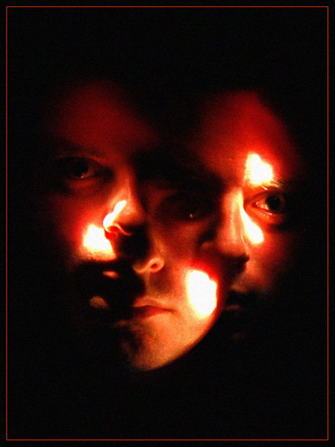
| Great effect. It seems to be a popular one for this challenge. I like how you changed the placement of the light on your face for each pictue. |
|
 Photographer found comment helpful. Photographer found comment helpful. |
|
|
12/09/2007 05:34:27 PM |
|
|
|
12/08/2007 07:01:48 PM |
| those don't look like fun faces to me! but I don't deduct for titles. :-) How's that for an insightful comment? |
|
|
|
12/07/2007 01:22:23 PM |
| I think with your red border you could have benefited from a single frame image centered in your photo. It's a little dark overall except the BRIGHT spots on your cheeks and forehead. BB |
|
|
|
12/07/2007 11:00:25 AM |
| I think good photo, but if the white areas would be little less "bright" how would it look... it looks like a movie poster, without text. Nice frame, cool photo overall. |
|
| Photographer found comment helpful. |
|
|
12/06/2007 06:53:15 AM |
| I like the idea, but think the lighting is a bit harsh on your face causing the blown out features. Nice composition however. Good work. |
|
| Photographer found comment helpful. |
|
|
12/06/2007 04:03:19 AM |
|
|
|
12/05/2007 11:48:25 AM |
| Very intense; the red/orange hue adds to that feeling. |
|
|
|
12/05/2007 06:57:35 AM |
| It's a great idea and it's very well done. |
|
|
|
12/04/2007 07:15:09 PM |
| wow quite a lot of people did this sort of idea didnt they. (: |
|
Home -
Challenges -
Community -
League -
Photos -
Cameras -
Lenses -
Learn -
Help -
Terms of Use -
Privacy -
Top ^
DPChallenge, and website content and design, Copyright © 2001-2025 Challenging Technologies, LLC.
All digital photo copyrights belong to the photographers and may not be used without permission.
Current Server Time: 04/07/2025 02:24:15 PM EDT.