| Author | Thread |
Comments Made During the Challenge  |
|
|
12/07/2007 06:01:27 PM |
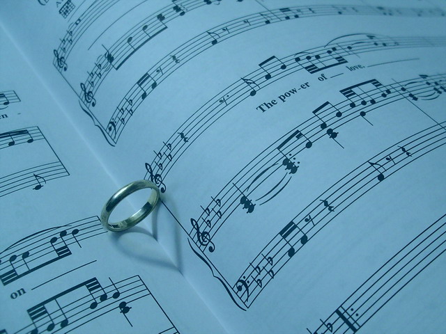
| I'm not digging the color temp choice - the blue seems awfully chilly - but the composition is very nice. |
|
 Photographer found comment helpful. Photographer found comment helpful. |
|
|
12/07/2007 02:12:16 AM |
| hmmm... i've seen this a few too many times. Nicely done though, and it's one of those pics that if it was shown anywhere other than DPC, would get a lot of respect. As it is, i'd say it needs more contrast, and instead of a blue tint, maybe an orange or something to warm it up because after all, love is not meant to be cold. |
|
| Photographer found comment helpful. |
|
|
12/06/2007 06:16:37 AM |
| I love the way the shadow of the ring forms a heart. Nicely composed! Very creative! (9) |
|
| Photographer found comment helpful. |
|
|
12/05/2007 07:42:36 AM |
| This would work better if it were brighter, I think. |
|
| Photographer found comment helpful. |
|
|
12/05/2007 07:09:27 AM |
|
| Photographer found comment helpful. |
|
|
12/04/2007 02:23:24 PM |
| I think I would like this better if the white balance were adjusted to get rid of the overwhelmingly blue cast. Not really an uplifting color ... although I suppose you could have done that intentionally as a counterpoint to the heart and happy-sounding lyric. But then I would expect a title to hint at such an interpretation. |
|
| Photographer found comment helpful. |
|
|
12/03/2007 03:24:30 PM |
| good DOF, good usage of the rule of thirds (twice) |
|
| Photographer found comment helpful. |
|
|
12/02/2007 07:23:51 PM |
Wish you all the Best with this!
Personally, I love this...
in fact, I did this last Free Study....
Too Bad I did not do well...
Feel free to see my portfolio for my version... Love Page |
|
| Photographer found comment helpful. |
|
|
12/02/2007 06:22:07 PM |
| Would benefit from tighter cropping. |
|
| Photographer found comment helpful. |
|
|
12/02/2007 05:47:23 PM |
| I have seen this type of image before but not with this sheet music. I think it might have been a little better if the paper was white and not blue. its a neat little trick with that shadow :) |
|
| Photographer found comment helpful. |
|
|
12/01/2007 09:12:58 AM |
| This has a really blue tone to it, which makes it feel cold.. Maybe some white balance or a filter added to warmen in up would have made it better for me. imho.. Love is red, hot and passionate.. 5 |
|
| Photographer found comment helpful. |
|
|
12/01/2007 07:41:15 AM |
| a little on the dark side, the levels in this don't seem quite right |
|
| Photographer found comment helpful. |
Home -
Challenges -
Community -
League -
Photos -
Cameras -
Lenses -
Learn -
Help -
Terms of Use -
Privacy -
Top ^
DPChallenge, and website content and design, Copyright © 2001-2025 Challenging Technologies, LLC.
All digital photo copyrights belong to the photographers and may not be used without permission.
Current Server Time: 04/07/2025 01:08:06 AM EDT.