| Author | Thread |
|
|
12/09/2007 08:55:52 PM |
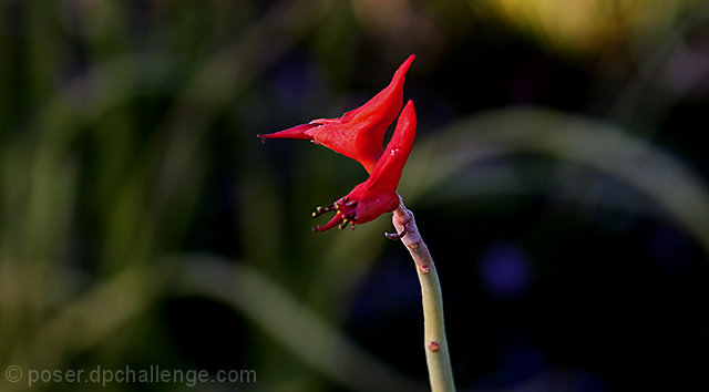
| This also would have worked well in complimentary colors - the red against the green is quite striking. If I recall, this was the one that prompted your comment in the thread about centering and rule of thirds, yes? You might want to play with this a bit with different crops - see how they strike your eye. But if in the end you like it as presented here, then that's the way it's supposed to be! |
|
 Photographer found comment helpful. Photographer found comment helpful. |
Comments Made During the Challenge  |
|
|
12/06/2007 06:49:45 PM |
| It looks like there might be some interesting detail there, and the color is nice, but the flower seems lost in the frame to me. I don't know whether you have the pixels, but I think this would be much stronger cropped much closer, and vertically, so the stem and flower fill most of the height of the frame and it's not much wider than the flower. |
|
| Photographer found comment helpful. |
|
|
12/05/2007 07:14:42 AM |
|
| Photographer found comment helpful. |
|
|
12/02/2007 03:07:19 PM |
| to much empty space but i like the contrast of the red flower against the greens & blues in the background. |
|
| Photographer found comment helpful. |
|
|
12/02/2007 01:50:40 PM |
| the bokeh is interesting but I don't like the crop, maybe take some more off of the right hand side. it does have a nice abstract quality. |
|
| Photographer found comment helpful. |
|
|
11/30/2007 07:44:26 PM |
| The object is too central IMO. |
|
| Photographer found comment helpful. |
Home -
Challenges -
Community -
League -
Photos -
Cameras -
Lenses -
Learn -
Help -
Terms of Use -
Privacy -
Top ^
DPChallenge, and website content and design, Copyright © 2001-2025 Challenging Technologies, LLC.
All digital photo copyrights belong to the photographers and may not be used without permission.
Current Server Time: 04/07/2025 02:08:28 AM EDT.