| Author | Thread |
Comments Made During the Challenge  |
|
|
03/02/2004 09:39:38 PM |
| Good idea and nice shot. I think Neat Image processing could get rid of the noise. |
|
 Photographer found comment helpful. Photographer found comment helpful. |
|
|
03/02/2004 01:59:20 PM |
| Cute subject ... you could do more with your lighting, though, and the image could be more saturated, with better contrast. |
|
| Photographer found comment helpful. |
|
|
02/29/2004 10:52:53 PM |
| Creative Idea! The background is too close. Seems grainy. |
|
| Photographer found comment helpful. |
|
|
02/29/2004 05:23:44 PM |
|
|
|
02/28/2004 02:21:09 AM |
| Sorry, I like the picture, but, I just don't see the conflict connection. |
|
|
|
02/27/2004 11:10:38 PM |
| Too close to your backdrop. Over exposed. |
|
| Photographer found comment helpful. |
|
|
02/27/2004 08:32:12 PM |
| A lot of noise, bad use of flash, poor focus. I am not sure about the conflict theme ... Sorry |
|
|
|
02/27/2004 10:23:16 AM |
| Nice idea. but lighting lets it down a bit. 6 |
|
| Photographer found comment helpful. |
|
|
02/27/2004 06:44:11 AM |
| Good concept - try playing with the contrast and levels |
|
| Photographer found comment helpful. |
|
|
02/27/2004 01:52:02 AM |
| i think i like this idea but the photo is technically bad and feels very rushed |
|
| Photographer found comment helpful. |
|
|
02/26/2004 10:58:56 PM |
| hehe, cute idea. Try moving your lighting off-axis for better effect. |
|
| Photographer found comment helpful. |
|
|
02/26/2004 10:08:32 PM |
| eliminate flash or reduce via diffusion. |
|
| Photographer found comment helpful. |
|
|
02/26/2004 08:13:25 PM |
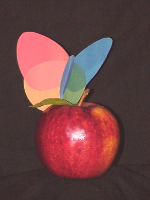
Interesting and creative idea, and it fits the challenge nicely. However, your technicals need some work. The shot it out of focus and very grainy. The lighting is very flat--looks like it was from directly in front, which along with the dead-center composition, is simply not very creative.
Your toughts definately show potential--you just need to work on the basics. Keep shooting!
4 |
|
| Photographer found comment helpful. |
|
|
02/26/2004 04:28:33 PM |
| A tad out of focus and a harsh reflection center apple. |
|
| Photographer found comment helpful. |
|
|
02/26/2004 03:19:17 PM |
| Creative idea for the challenge. Your light is really strong and the colors are a bit washed out. Neat idea. |
|
| Photographer found comment helpful. |
|
|
02/25/2004 07:28:42 PM |
This has the potential of a great shot. Original and funny and a nice depiction of the challenge. The problems I have with this shot are these:
- the contrast could be boosted up, easy thing to do in post processing.
- the light source is directly in front of the apple which to me is a bit distractng, a softer light at another angle could fix this.
Score: 5
Good job nonetheless! Good luck! |
|
| Photographer found comment helpful. |
|
|
02/25/2004 05:58:31 PM |
|
| Photographer found comment helpful. |
|
|
02/25/2004 05:09:53 PM |
| Apple vs. MSN Messenger surely?! |
|
| Photographer found comment helpful. |
|
|
02/25/2004 01:04:22 AM |
| The reflection on the apple is a bit distracting. |
|
| Photographer found comment helpful. |
|
|
02/25/2004 12:13:55 AM |
| The lighting and contrast could be better. |
|
| Photographer found comment helpful. |
Home -
Challenges -
Community -
League -
Photos -
Cameras -
Lenses -
Learn -
Help -
Terms of Use -
Privacy -
Top ^
DPChallenge, and website content and design, Copyright © 2001-2026 Challenging Technologies, LLC.
All digital photo copyrights belong to the photographers and may not be used without permission.
Current Server Time: 02/01/2026 11:36:00 AM EST.