| Author | Thread |
Comments Made During the Challenge  |
|
|
02/29/2004 09:33:45 PM |
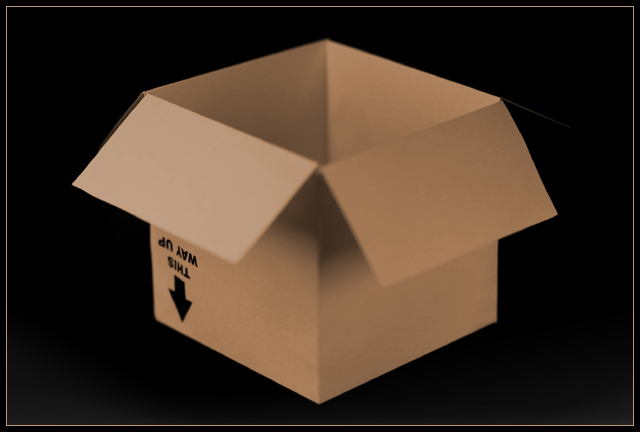
| Nice background. Box is out of focus. Interesting composition and irony. |
|
 Photographer found comment helpful. Photographer found comment helpful. |
|
|
02/29/2004 01:12:12 AM |
| Yup, that's what it is. the focus is rather soft on the flaps. the lighting is very good. the composition is static because of the centre placement of the subject in the frame. The subject still looks like a plain old ordinary storage box. |
|
| Photographer found comment helpful. |
|
|
02/28/2004 01:34:58 PM |
| Yes if you had the whole box in focus! |
|
| Photographer found comment helpful. |
|
|
02/28/2004 07:16:03 AM |
|
| Photographer found comment helpful. |
|
|
02/27/2004 09:19:08 AM |
| Clever! I love the message on the box, which added to your lighting makes this box special indeed. |
|
| Photographer found comment helpful. |
|
|
02/26/2004 06:42:47 AM |
| I like the idea here, but the overall effect would have been better if sharp. |
|
| Photographer found comment helpful. |
|
|
02/25/2004 01:50:31 PM |
| Interesting, but very shallow DOF. |
|
| Photographer found comment helpful. |
|
|
02/24/2004 07:40:49 PM |
| Very nice interpretation which I woudl have voted higher for had it all been in focus. Still a good 7. |
|
| Photographer found comment helpful. |
|
|
02/23/2004 08:22:31 PM |
| soft focus does add interest - could use a bit more to lift if squarely out of the mundane |
|
| Photographer found comment helpful. |
|
|
02/23/2004 05:14:05 PM |
| Really a good idea for the challenge.....but this appears very fuzzy/OOF. Soft filter/lens? Just doesn't work for me on a shot of a cardboard box. Sorry, wish ya luck in the challenge. |
|
| Photographer found comment helpful. |
|
|
02/23/2004 09:32:14 AM |
|
| Photographer found comment helpful. |
|
|
02/23/2004 09:21:37 AM |
| I like the humor. Would like to see greater DOF or alternate focus point. |
|
| Photographer found comment helpful. |
|
|
02/23/2004 08:28:29 AM |
| I think your chosen depth of field actually works against this image: i don't seen the real benefit of stressing those particular angles of the flaps against the rest of the box. Sure, the text is ;egible, but as a point that would stand out against the regularity of the rest of the box, I don't think it neededd to be accentuated this way - for me, it only leaves the rest of the image to seem odd, as opposed to 'extraordinary'. |
|
| Photographer found comment helpful. |
|
|
02/23/2004 03:20:57 AM |
| I want more focus! Or at least pull it forward so the closest parts are sharp... |
|
| Photographer found comment helpful. |
Home -
Challenges -
Community -
League -
Photos -
Cameras -
Lenses -
Learn -
Help -
Terms of Use -
Privacy -
Top ^
DPChallenge, and website content and design, Copyright © 2001-2026 Challenging Technologies, LLC.
All digital photo copyrights belong to the photographers and may not be used without permission.
Current Server Time: 02/01/2026 10:22:42 AM EST.