| Author | Thread |
Comments Made During the Challenge  |
|
|
02/29/2004 11:37:45 PM |
| Very good use of shallow dof. I like the composition as well -- it is balanced without being overbearing. Nice work. |
|
|
|
02/29/2004 10:07:08 PM |
| Beatiful composition. Great color, light and DOF. |
|
 Photographer found comment helpful. Photographer found comment helpful. |
|
|
02/29/2004 07:21:59 PM |
|
| Photographer found comment helpful. |
|
|
02/29/2004 01:09:20 AM |
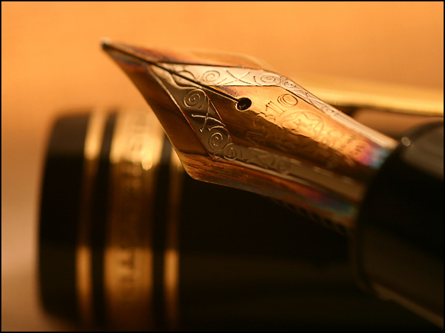
| very nice....the eye shadow person might want to look at this to see what I might have had in mind for that shot.....the detail on the pen is very good and the lighting excellent. Very much like the composition and the pen tip looks great against the tiem in the DOF with the corresponding shining gold on its labe. Well lit. |
|
| Photographer found comment helpful. |
|
|
02/28/2004 02:26:13 PM |
| Super macro. Nice, moody feel to this image. 9 |
|
| Photographer found comment helpful. |
|
|
02/28/2004 12:46:32 PM |
| Nice color. Sharp focus. But HUH? re title... what is message? |
|
| Photographer found comment helpful. |
|
|
02/27/2004 10:46:06 AM |
| This doesn't really meet teh extraordinary part of the challenge. |
|
| Photographer found comment helpful. |
|
|
02/27/2004 02:28:00 AM |
|
| Photographer found comment helpful. |
|
|
02/26/2004 11:23:34 PM |
| Nice colour and composition and the lighting works. I like shallow dof but this imo is way too shallow. It would be better composed if the focus was on the entire metal part of the pen. |
|
| Photographer found comment helpful. |
|
|
02/26/2004 02:17:50 PM |
| just a tad sharper and you would have a winner 8 |
|
| Photographer found comment helpful. |
|
|
02/26/2004 06:10:15 AM |
| A greater DoF would have worked wonders - Nice anyways |
|
| Photographer found comment helpful. |
|
|
02/26/2004 04:10:12 AM |
| Pretty pen. Like the dof and the composition. The colors(wb) go well with the subject. I do think the focus would have been more effective on the point of the pen. Focus point depends on what the photographer wants to highlight in the photo, so I guess there could be something else I'm not understanding, sorry. |
|
| Photographer found comment helpful. |
|
|
02/25/2004 06:46:10 PM |
| I like this one. It's clear you took the time to light it and compose it well. I like the details in the pen. Good luck! |
|
| Photographer found comment helpful. |
|
|
02/25/2004 01:46:09 PM |
| A-a-ah! The tip _must_ be in focus!!! |
|
| Photographer found comment helpful. |
|
|
02/25/2004 10:29:22 AM |
| I love the tones used here. Very nice DOF as well. |
|
| Photographer found comment helpful. |
|
|
02/24/2004 05:31:58 PM |
| That light is just golden. I like the angle of the nib and the low DOF throwing out the cap behind it. The background blends well with the golden nib without losing definition of the shape of the nib. |
|
| Photographer found comment helpful. |
|
|
02/24/2004 07:55:17 AM |
| I think it would have been better if the nib was completely in focus |
|
| Photographer found comment helpful. |
|
|
02/23/2004 03:14:02 PM |
| I'd like to see the whole tip (nib?) in focus - orange background sets off the colors well |
|
| Photographer found comment helpful. |
|
|
02/23/2004 01:43:27 PM |
| excellent macro. I like the warm feeling and the shallow depth of field and soft focus. |
|
| Photographer found comment helpful. |
|
|
02/23/2004 12:28:46 AM |
I'm not sure that this qualifies as mundane anymore... Nice shot never the less!
TC |
|
| Photographer found comment helpful. |
|
|
02/23/2004 12:08:24 AM |
| IMO, should have focused on the tip |
|
| Photographer found comment helpful. |
Home -
Challenges -
Community -
League -
Photos -
Cameras -
Lenses -
Learn -
Help -
Terms of Use -
Privacy -
Top ^
DPChallenge, and website content and design, Copyright © 2001-2026 Challenging Technologies, LLC.
All digital photo copyrights belong to the photographers and may not be used without permission.
Current Server Time: 02/01/2026 11:20:24 AM EST.