| Author | Thread |
|
|
03/03/2004 04:38:44 AM |
Hi everybody,
Thanks for your comments. It was my first participation to the challenge. I will learn.
Bye
Bernard
|
|
Comments Made During the Challenge  |
|
|
03/02/2004 05:53:02 PM |
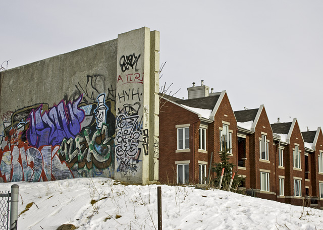
| Great idea and nice take on the challenge. Beautiful shot. |
|
|
|
03/02/2004 05:47:55 PM |
| Probably should have croped out the fence post. |
|
 Photographer found comment helpful. Photographer found comment helpful. |
|
|
03/02/2004 04:51:36 PM |
| Should have cropped out that chain link fence.l |
|
| Photographer found comment helpful. |
|
|
03/02/2004 07:27:58 AM |
| Nice clear picture. Beautiful quality. |
|
|
|
03/01/2004 12:09:12 PM |
| With the exception of the cyclone fence in the lower right corner this is a great composition, and nicely sets up a static conflict. The light is a bit flat and next time I would order the sun to burn a bit brighter if I were you ;) A top ten. |
|
| Photographer found comment helpful. |
|
|
02/29/2004 11:02:13 AM |
Good image, I like the angle of shot which shows off the contrast between the buildings and graffiti wall very well.
A few poles, posts and branches in the picture which would have been better avoided..if that was possible..(If only it had been advanced editing) but still works very well. |
|
| Photographer found comment helpful. |
|
|
02/29/2004 03:12:51 AM |
It´s a good photo but for me there are to many small stuffs in the photo that are distracting, like the stuff in front of the cristmastree, the fench in the leftdown corner , the bar in the middel and so on
|
|
| Photographer found comment helpful. |
|
|
02/29/2004 01:20:10 AM |
| Is this supposed to be like an 8 mile thing??? |
|
|
|
02/28/2004 01:00:21 PM |
| Nice idea, but I find the division a bit too close to the centre. |
|
|
|
02/27/2004 09:49:53 AM |
| Very nicely observed. Good job. |
|
|
|
02/27/2004 09:31:03 AM |
| nice use of 'conflict' not big on the photo however, I think it's too saturated or too sharp, I can't tell which. 4. |
|
|
|
02/27/2004 08:53:55 AM |
|
|
|
02/26/2004 09:36:33 PM |
| nicely composed contrast of art of graffitti and art of architecture. the fence in the bottom left needs to not conflict with the image and exit the premises. this would be improved if the snow on the right "cleaner" half was also cleaner. but good capture of life:7 |
|
| Photographer found comment helpful. |
|
|
02/25/2004 09:06:18 PM |
| this is a perfect portrayal of conflict |
|
|
|
02/25/2004 07:12:58 PM |
| I like the contrasting styles you captured. Good job! |
|
| Photographer found comment helpful. |
|
|
02/25/2004 03:41:05 PM |
| The fence on the lower left is a bit distracting but otherwise good picture. |
|
|
|
02/25/2004 01:13:58 PM |
Good photo, I can see the conflict. Some creative cropping would have been better. top, bottom and sides
|
|
| Photographer found comment helpful. |
|
|
02/25/2004 12:23:13 PM |
| Is this The Bronx? Gun Hill Road? |
|
|
|
02/25/2004 09:57:53 AM |
| Great title - fits the photograph perfectly. Excellent colour on this, very creative idea, and a fantastic job on meeting the challenge. |
|
| Photographer found comment helpful. |
|
|
02/25/2004 09:11:09 AM |
| WOW what a contrast. Two different realities....good concept. 8 |
|
|
|
02/25/2004 03:52:32 AM |
| great contrast shown here! |
|
|
|
02/24/2004 11:42:47 PM |
| Got a point there. The fence down left and other things at the bottom are distracting. Would recomend more croping. |
|
| Photographer found comment helpful. |
Home -
Challenges -
Community -
League -
Photos -
Cameras -
Lenses -
Learn -
Help -
Terms of Use -
Privacy -
Top ^
DPChallenge, and website content and design, Copyright © 2001-2025 Challenging Technologies, LLC.
All digital photo copyrights belong to the photographers and may not be used without permission.
Current Server Time: 04/06/2025 09:09:24 PM EDT.