| Author | Thread |
Comments Made During the Challenge  |
|
|
11/27/2007 12:11:43 AM |
|
|
|
11/26/2007 10:52:08 AM |
|
|
|
11/26/2007 10:47:36 AM |
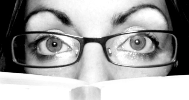
| Not very sharp, off lighting, and distracting. |
|
 Photographer found comment helpful. Photographer found comment helpful. |
|
|
11/26/2007 09:59:23 AM |
| Pretty harsh light and blown highlights. |
|
| Photographer found comment helpful. |
|
|
11/26/2007 09:49:27 AM |
| Eyes need to be in focus. |
|
| Photographer found comment helpful. |
|
|
11/26/2007 04:10:53 AM |
| Good idea, it is a bit bright, or maybe too close up. 6. |
|
| Photographer found comment helpful. |
|
|
11/25/2007 04:51:53 PM |
| Looks a bit out of focus, a little too shiny, and the crop doesn't appeal to me too much! |
|
| Photographer found comment helpful. |
|
|
11/25/2007 05:30:44 AM |
| Conceptually I can buy this as it at least shows someone adding to their knowledge or 'book smarts' by reading a book. Technically this picture needs to be thrown a life preserver. First you can barely make out that there is a book in this shot. The white is so bright as to be almost overexposed and the object itself gets so little space in the frame as to be incidental to the photo. I like the expression on the face, those super arched eyebrows are a keeper, but the focus here is very poor. I can't see anything in focus at all. Lighting is rough across the board with some nasty highlights around the eyes near the nose. Glasses were a good choice (if a choice) and are of a nice book-wormish quality. |
|
| Photographer found comment helpful. |
|
|
11/24/2007 05:17:51 PM |
|
| Photographer found comment helpful. |
|
|
11/23/2007 07:26:40 PM |
| I like this shot! It might have been a little more effective in color. And of course being in focus always helps. Great idea though! |
|
| Photographer found comment helpful. |
|
|
11/23/2007 05:16:56 PM |
| You did a good job of filling the frame. Needs sharper focus, and highlights on the foreground pages are too blown out. |
|
| Photographer found comment helpful. |
|
|
11/23/2007 07:49:47 AM |
a bit scary...
and too much flash. |
|
| Photographer found comment helpful. |
|
|
11/23/2007 01:12:17 AM |
| Highlights are burned out. I like the eyes and the glasses but would have eliminated the eye makeup and adjusted exposure. I would have liked to see this same version but with the eyes looking down to the book. |
|
| Photographer found comment helpful. |
|
|
11/22/2007 07:22:01 PM |
| Nice eyes. I like this except for a slight lack of focus on the eyes and glasses. Some more focus or sharpening there would really make this pop. |
|
| Photographer found comment helpful. |
|
|
11/21/2007 05:57:12 PM |
| great crop. too close, as it is too blurred because of that. but i love the crop and idea of this. |
|
| Photographer found comment helpful. |
|
|
11/21/2007 09:31:18 AM |
| a sharper focus and less harsh lighting would make this a much more effective shot |
|
| Photographer found comment helpful. |
|
|
11/21/2007 06:35:01 AM |
| Nicely composed, but just not very sharp. |
|
| Photographer found comment helpful. |
|
|
11/21/2007 06:32:47 AM |
|
| Photographer found comment helpful. |
|
|
11/21/2007 05:56:15 AM |
| Wow...color (as opposed to B&W) and better focus and you'd have a really nice shot here. |
|
| Photographer found comment helpful. |
|
|
11/21/2007 05:10:32 AM |
| the composition could have been more engaging and parts of the picture is overexposed.. |
|
| Photographer found comment helpful. |
|
|
11/21/2007 04:00:36 AM |
| The lack of sharpness on the eyes, the harsh lighting, expression and close up of the image reminds me of the Blair Witch Project. If her eyes were pointed down, and she were really "in" the book, might be better. |
|
| Photographer found comment helpful. |
|
|
11/20/2007 08:37:35 PM |
| Contrast levels in this photo seem to be off. Lighting is a bit harsh. |
|
|
|
11/20/2007 07:39:59 PM |
| aw man I wish this was a lot sharper. Those eyes are beautiful |
|
| Photographer found comment helpful. |
Home -
Challenges -
Community -
League -
Photos -
Cameras -
Lenses -
Learn -
Help -
Terms of Use -
Privacy -
Top ^
DPChallenge, and website content and design, Copyright © 2001-2025 Challenging Technologies, LLC.
All digital photo copyrights belong to the photographers and may not be used without permission.
Current Server Time: 04/07/2025 02:02:35 AM EDT.