| Author | Thread |
Comments Made During the Challenge  |
|
|
11/12/2007 05:33:59 PM |
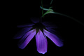
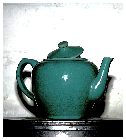
| I like this composition a lot. I think slightly less light or a lower exposure in some capacity would have made it even better. |
|
 Photographer found comment helpful. Photographer found comment helpful. |
|
|
11/12/2007 09:54:56 AM |
|
| Photographer found comment helpful. |
|
|
11/12/2007 05:50:32 AM |
| LOVE this. It's so simple and pretty. |
|
| Photographer found comment helpful. |
|
|
11/10/2007 11:49:52 PM |
| the white border bleeds out the image, nice pot |
|
| Photographer found comment helpful. |
|
|
11/10/2007 02:55:10 PM |
| Very stark. I think the white areas on the teapot work but I don't like the glare in the black area at the bottom of the frame. |
|
| Photographer found comment helpful. |
|
|
11/10/2007 03:32:18 AM |
|
| Photographer found comment helpful. |
|
|
11/09/2007 10:20:25 AM |
| I like the old photo effect on this. The turquoise screams '60s to me. I remember this being the color that seemed to be "in" when I was a little kid. |
|
| Photographer found comment helpful. |
|
|
11/08/2007 09:59:11 AM |
| I really like this!! Nice and dramatic, altho seems very high in contrast to the point there's hot spots that's why I will give 9 and not a 10 =p |
|
| Photographer found comment helpful. |
|
|
11/08/2007 09:09:07 AM |
| I think its too centered and may have been more interesting if it was illuminated from the side. |
|
| Photographer found comment helpful. |
|
|
11/07/2007 06:18:40 AM |
| Nice composition, lighting, and colors. |
|
| Photographer found comment helpful. |
|
|
11/07/2007 02:18:31 AM |
| The blowouts and the reflections are too distracting. |
|
| Photographer found comment helpful. |
Home -
Challenges -
Community -
League -
Photos -
Cameras -
Lenses -
Learn -
Help -
Terms of Use -
Privacy -
Top ^
DPChallenge, and website content and design, Copyright © 2001-2025 Challenging Technologies, LLC.
All digital photo copyrights belong to the photographers and may not be used without permission.
Current Server Time: 04/07/2025 05:57:02 AM EDT.