| Author | Thread |
Comments Made During the Challenge  |
|
|
11/12/2007 07:28:47 PM |
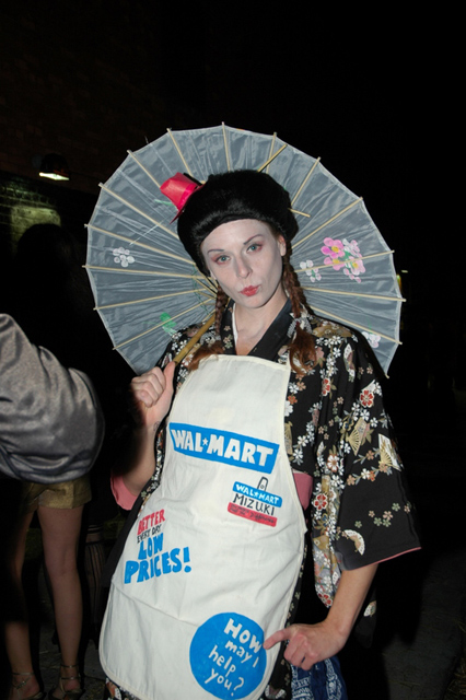
| the lighting seems a bit harsh, maybe bouncing the flash or using a diffuser would help tone it down. The lack of directional light and use of head on lighting gives a somewhat dull and snapshot feel, imo. |
|
|
|
11/12/2007 04:47:28 AM |
| arm in composition does not work for me...a 5 |
|
|
|
11/10/2007 04:28:47 PM |
|
|
|
11/09/2007 10:05:18 PM |
| two steps to 5+ picture: 1. crop to get rid of the arm (or whatever) on the left. 2. increase saturation to bring up the colors. |
|
|
|
11/09/2007 02:12:39 PM |
| I voted this a little low due to the other light source on the wall behind your subject. |
|
|
|
11/08/2007 08:04:00 PM |
| I hate WM. Too cluttered, like WM. 1. |
|
|
|
11/08/2007 10:56:24 AM |
| Interesting subject. I think there's too much space at the top of the frame and obviously the arm on the left shouldn't be there. Perhaps a tighter crop would have helped. |
|
Home -
Challenges -
Community -
League -
Photos -
Cameras -
Lenses -
Learn -
Help -
Terms of Use -
Privacy -
Top ^
DPChallenge, and website content and design, Copyright © 2001-2025 Challenging Technologies, LLC.
All digital photo copyrights belong to the photographers and may not be used without permission.
Current Server Time: 04/07/2025 12:46:35 AM EDT.