| Author | Thread |
|
|
11/09/2007 01:32:11 PM |
Hi Deb,
I think this is actually a much better than average photo, entered in the wrong challenge. It doesn't really say "new" to my American brain.
As far as the image goes, since you couldn't take it at a different time of day, I think you could get a lot by using levels to make the midtones (a lot) darker. the image isn't really overexposed, the highlights and shadows are in the right place, but overall, the image is too bright.
The other thing would be cropping off the bottom "empty" portion. It isn't really adding anything to the shot, and just sucking my attention away from the important bits. |
|
 Photographer found comment helpful. Photographer found comment helpful. |
|
|
11/08/2007 04:35:03 AM |
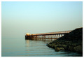
Great photo, Deb! It is interesting, exotic (from a US perspective) and has all the technicals. Probably lacks the right challenge - it definitely fits, but might do better in "construction" or something. Lacks that WOW factor as well - not sure what you can do about that.
I would name it "Rebuilding the Tower of Babel" just because that's the first thing I thought of. :) |
|
| Photographer found comment helpful. |
|
|
11/07/2007 09:48:57 AM |
I love the photo, and think it is a wonderful addition to your Middle East gallery! Lately, it seems there is no method to the voters voting pattern -- it sure isn't always based on the best ones getting the highest scores -- that's for sure!
|
|
| Photographer found comment helpful. |
|
|
11/07/2007 05:34:53 AM |
Saw your 'what could I have done' in one of the forum threads. I personally believe thta this was a photo that was undervalued by the voters as a whole. here is why a gave it an 8:
Clearly meets the challenge.
Good exposure.
Super colour - well saturated blues, but natural looking.
Intersting subject.
Excellent composition. It ws the composition that took the photo up to an 8 for me - strong leading lines taking me up the scaffolding and back down the other side; superbly balanced, with the two men standing on either side; really good use of triangles. The only thing I might have changed would have been to include very slightly less foreground, but then you would have lost one of the lead-in lines, so may-be not! |
|
| Photographer found comment helpful. |
|
|
11/07/2007 12:20:01 AM |
| Really cool idea, and really cool photo too. |
|
| Photographer found comment helpful. |
Comments Made During the Challenge  |
|
|
11/01/2007 01:07:42 PM |
| outstanding interpretation of the challenge. overall it seem to be a bit flat. too many colors that are too similar. a balanced modification of curves and saturation could probaly boost the construction out of the background. |
|
| Photographer found comment helpful. |
|
|
11/01/2007 12:07:25 AM |
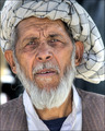
| Wow, these men are cool-looking! Angular, like their building! Love your detail and tonal values. btw...what are they building? |
|
| Photographer found comment helpful. |
|
|
10/31/2007 08:14:03 AM |
|
| Photographer found comment helpful. |
|
|
10/31/2007 07:16:58 AM |
| Workplace, Health and Safety here in Australia would be very busy over there - GRIN! |
|
| Photographer found comment helpful. |
Home -
Challenges -
Community -
League -
Photos -
Cameras -
Lenses -
Learn -
Help -
Terms of Use -
Privacy -
Top ^
DPChallenge, and website content and design, Copyright © 2001-2026 Challenging Technologies, LLC.
All digital photo copyrights belong to the photographers and may not be used without permission.
Current Server Time: 02/01/2026 05:54:41 AM EST.