| Author | Thread |
|
|
02/26/2004 10:35:57 AM |
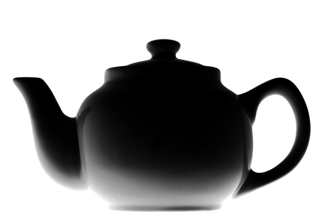
I really liked this shot. Gave it a 9.
Sorry thought I had left a comment. ??
This is a great looking pot and would make a cool series. |
|
|
|
02/26/2004 09:33:11 AM |
| You lost me the shadow the form the isolation of the top from the bottom. After just awhile the form abstracts itself. |
|
Comments Made During the Challenge  |
|
|
02/20/2004 01:47:25 AM |
| The hard lighting really emphasizes the beautiful curves in the teapot. The lighting of the subject from underneath really gives a dramatic feeling to the composition. The reflections of the spout and the handle makes you feel the smooth surface of the teapot. "10" |
|
|
|
02/18/2004 09:20:24 PM |
First a question, is the pot actually black or are you working on the silhoette effect? Now my comment. Just the ever slightest amount of fill light to bring in just a smidge of detail at the top of the pot and this is spot on still life!
TC |
|
|
|
02/18/2004 03:13:05 PM |
| Great control of the important things, especially the light. Interesting placement of the lights. This is evidently a good photo, so I feel odd saying this, but did you try a square crop? It might have contrasted nicely with the roundness of the pot. |
|
|
|
02/18/2004 12:17:51 PM |
| I like the lighting of the teapot and how therefore the shadows work out. Clean background makes it stand out well. It is just that the teapot stands on it own, not very interesting. Its the way how it goes from bright to dark that makes it interesting. 9 |
|
|
|
02/18/2004 10:51:19 AM |
| Great arrangement with an awesome light and a very clean white. The image could be from a design study. Hope you do very well. |
|
|
|
02/17/2004 05:07:43 PM |
| Nice lighting. this is superb. |
|
|
|
02/17/2004 10:07:45 AM |
| Interesting lighting effect. |
|
|
|
02/17/2004 05:24:17 AM |
| Very creative -- would like to hear how this one was set up! But I love the stark contrast, moving into the gradient! Great! |
|
|
|
02/17/2004 02:34:09 AM |
| Cute, simple picture, with flawless gradients. Nice! :) |
|
|
|
02/16/2004 02:37:34 PM |
great lighting and contrast
meets challenge |
|
|
|
02/16/2004 01:59:54 PM |
| I marked this low because I don't see the black in the subject. Feel free to send me a PM, and I'd be happy to reconsider. |
|
|
|
02/16/2004 08:41:14 AM |
| Lovely shot, very good light control. Love the subject you picked for the challenge. Nice one. |
|
|
|
02/16/2004 07:02:08 AM |
| A little on the bright side on the lower left, but I like it. Very simplistic, not a full silhouette so it doesnt look like a cardboard cutout, but the light at the bottom and along the spout gives it a good three-dimensional look. If I was to nitpick I may have suggested a little light on the top right side so it didnt look so flat and give it the same 'body' as the rim on the left. |
|
|
|
02/15/2004 09:42:31 PM |
| You cannot get much more simple than this. And yet, so elegant. |
|
|
|
02/15/2004 07:07:42 PM |
| Very interesting lighting here. |
|
Home -
Challenges -
Community -
League -
Photos -
Cameras -
Lenses -
Learn -
Help -
Terms of Use -
Privacy -
Top ^
DPChallenge, and website content and design, Copyright © 2001-2025 Challenging Technologies, LLC.
All digital photo copyrights belong to the photographers and may not be used without permission.
Current Server Time: 04/07/2025 01:00:54 PM EDT.