| Author | Thread |
Comments Made During the Challenge  |
|
|
02/24/2004 10:33:37 PM |
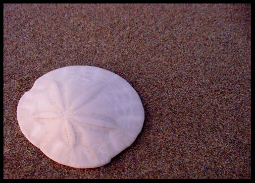
| Interesting idea and great composition. However the lighting doesn't enhance the sand dollar for detail and texture contrast. |
|
 Photographer found comment helpful. Photographer found comment helpful. |
|
|
02/24/2004 01:06:50 PM |
Your light setup don´t help you to reveal the textures of the subject. To reveal textures the light must be in a hard angle setuped to do it. A common setup is a lateral 45 or 90 degrees. But top or down light works well too.
|
|
| Photographer found comment helpful. |
|
|
02/23/2004 11:41:00 PM |
| Very nice, sand dollar on rough sand, meets the challenge, you also used the rule of thirds well done. |
|
| Photographer found comment helpful. |
|
|
02/23/2004 10:23:03 PM |
| Nice composition, but a touch sof looking. I wish I could see a little more detain in the sand dollar |
|
| Photographer found comment helpful. |
|
|
02/22/2004 07:39:22 PM |
| I appreciate shots such as this. I love the lighting and I believe it is quite effective in making the subject pop out as interesting. The texture of the sand is wonderful. Very nice shot and good luck! |
|
| Photographer found comment helpful. |
|
|
02/22/2004 09:08:33 AM |
| Good idea. I might've cropped it in even closer to pick up more of the texture of the sand dollar and the sand. |
|
| Photographer found comment helpful. |
|
|
02/22/2004 06:00:27 AM |
| The sand dollar looks to smooth. |
|
| Photographer found comment helpful. |
|
|
02/21/2004 06:44:47 AM |
|
| Photographer found comment helpful. |
|
|
02/20/2004 04:02:07 PM |
| I love the grain and color of the sand in this shot. The whiteness of the sand dollar sets it off nicely. |
|
| Photographer found comment helpful. |
|
|
02/20/2004 11:53:54 AM |
| Your sanddollar shot is nicely composed and fits the challenge. It could be a bit sharper, but the colors are nice. |
|
| Photographer found comment helpful. |
|
|
02/20/2004 07:09:15 AM |
| quite a small image - -but nice in some way. |
|
| Photographer found comment helpful. |
|
|
02/20/2004 05:48:48 AM |
| This is a really nice, calming shot. Could have benefitted from some work in your graphics package. Seems a little sharpening would have brought out loads more details. The left hand corners seem a little dark maybe? |
|
| Photographer found comment helpful. |
|
|
02/20/2004 01:58:23 AM |
[World Record Attempt]
+ Composition is nice; I like the contrast between the colours and the rough surface versus the smooth one.
- Can't think of any. |
|
| Photographer found comment helpful. |
|
|
02/19/2004 05:40:08 PM |
| I like the way the sand looks... |
|
| Photographer found comment helpful. |
|
|
02/19/2004 03:50:07 PM |
| There's a suggestion of evening about this - the warm and cool light from either side, and also in the tones of the sand. A sort of mourbful image, i think. Probably not eye-catching enough for dpc, but nice work, and thanks for sharing it. |
|
| Photographer found comment helpful. |
|
|
02/19/2004 12:07:38 PM |
| I like this. I think it would have been stronger with better lighing on the sand. It seems a bit dim. |
|
| Photographer found comment helpful. |
|
|
02/19/2004 10:26:03 AM |
| I know the texture is there but it doesn't jump put at me. |
|
| Photographer found comment helpful. |
|
|
02/18/2004 11:59:36 AM |
| Although this feels generally smooth - it has great texture. Good use of space and contrast. Border works well to pull it all together. Only wish the star on the sand dollar was more distinguishable. One of my top picks - good job! |
|
| Photographer found comment helpful. |
Home -
Challenges -
Community -
League -
Photos -
Cameras -
Lenses -
Learn -
Help -
Terms of Use -
Privacy -
Top ^
DPChallenge, and website content and design, Copyright © 2001-2026 Challenging Technologies, LLC.
All digital photo copyrights belong to the photographers and may not be used without permission.
Current Server Time: 02/01/2026 06:56:40 AM EST.