| Author | Thread |
|
|
10/27/2007 11:14:02 AM |
| I know you can do better than this, because I've seen some of your other work. The whole image seems a bit gray. I think a levels adjustment might help. I like your message. It deserves a bit more effort. |
|
 Photographer found comment helpful. Photographer found comment helpful. |
|
|
10/26/2007 11:32:17 PM |
| I like the idea, but yeah, the lighting and low contrast don't help it. You could use this as a processing exercise - see what you can do about the contrast and sharpness. |
|
| Photographer found comment helpful. |
Comments Made During the Challenge  |
|
|
10/23/2007 09:23:07 AM |
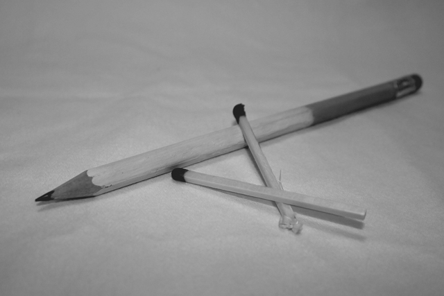
| I don't quite get this --- if you are going for a cigarette feel, I would have added some smoke coming out of the pencil. A bit more contrast would have helped too (the image is a bit flat)and would have made those darks stand out more. |
|
| Photographer found comment helpful. |
|
|
10/22/2007 08:54:40 AM |
| Lower ISO and better focus would improve the image |
|
| Photographer found comment helpful. |
|
|
10/20/2007 02:44:54 PM |
| I think more contrast is needed to create a more impacting picture.. |
|
| Photographer found comment helpful. |
|
|
10/20/2007 03:49:09 AM |
| Probably safer with the graphite. Seems a tad unsharp IMO. |
|
| Photographer found comment helpful. |
|
|
10/19/2007 10:59:36 AM |
| your title might go better if you had a cig box in the shot as well. I am assuming that by "cancer stick" you are talking about cigarrettes, but the pencil does not really convey that. |
|
| Photographer found comment helpful. |
|
|
10/19/2007 09:19:31 AM |
| Nice idea. Everything falls in the midtones. Would like to see some true blacks and whites. |
|
| Photographer found comment helpful. |
|
|
10/18/2007 03:18:43 PM |
| Dull and boring. Is it on a tissue? |
|
| Photographer found comment helpful. |
|
|
10/18/2007 12:07:08 PM |
| I don't get the title? Hmmmmmmm Seems oof as well |
|
| Photographer found comment helpful. |
|
|
10/18/2007 10:22:40 AM |
| The title is the only thing that is gettng your message accross. |
|
| Photographer found comment helpful. |
|
|
10/18/2007 06:36:00 AM |
| I really dig the idea behind this, but the contrast is distractingly flat. |
|
| Photographer found comment helpful. |
|
|
10/18/2007 01:17:12 AM |
| I don't quite understand what's the idea behind the image |
|
| Photographer found comment helpful. |
|
|
10/17/2007 10:36:06 PM |
| I like your idea. The colors and gray areas seem a little flat to me. Perhaps if there was more contast or if the pencil was in an ash tray, I would have scored it higher. |
|
| Photographer found comment helpful. |
|
|
10/17/2007 02:08:28 PM |
| This image really lacks contrast. Making the whites brighter would have helped a lot. |
|
| Photographer found comment helpful. |
|
|
10/17/2007 09:53:49 AM |
| Underexposed. Needs more contrast...adjust levels. |
|
| Photographer found comment helpful. |
|
|
10/17/2007 09:15:00 AM |
|
| Photographer found comment helpful. |
|
|
10/17/2007 04:56:16 AM |
| The lighting is bad. And the whole shot is dull. |
|
| Photographer found comment helpful. |
Home -
Challenges -
Community -
League -
Photos -
Cameras -
Lenses -
Learn -
Help -
Terms of Use -
Privacy -
Top ^
DPChallenge, and website content and design, Copyright © 2001-2026 Challenging Technologies, LLC.
All digital photo copyrights belong to the photographers and may not be used without permission.
Current Server Time: 02/01/2026 08:48:33 AM EST.