| Author | Thread |
Comments Made During the Challenge  |
|
|
02/24/2004 07:06:14 AM |
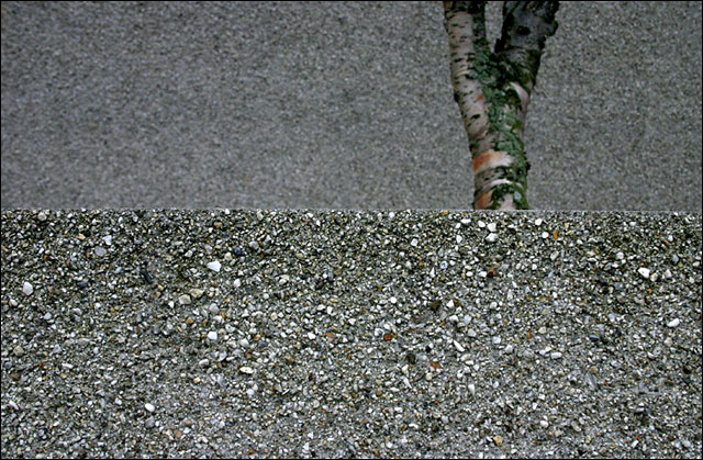
| interesting and creative picture. i think it might be even more abstract if the tree wasin better focus..but overall good. |
|
|
|
02/23/2004 05:13:17 AM |
| feel this needs an extra nudge on the DOF to make the bark more sharp. |
|
|
|
02/22/2004 08:10:25 AM |
| I so wish the tree was sharp, too. I really like the idea. |
|
|
|
02/21/2004 01:54:49 AM |
| cool abstract composition! yeah! |
|
|
|
02/20/2004 06:02:31 PM |
| Yes! I am very fond of this type of work. I really hope this does well. 10 |
|
|
|
02/20/2004 11:32:22 AM |
| Good capture of the stone 'Texture'. Good contrast. Perhaps a wider DOF would bring the tree into a little sharper contrast? |
|
|
|
02/19/2004 07:44:41 PM |
| Interesting POV, nice shot. |
|
|
|
02/19/2004 02:49:14 PM |
| Not much of interest here. Other then it does meet the challenge i have nothing else to say about it. |
|
|
|
02/19/2004 11:39:59 AM |
| Interesting. Deth of field can't quite cope with the shot as you have it set here - this kind of hyper-focal shot I think requires the use of manual focussing really. Good texture on the nearer wall, a touch too dim and just beyond the focal plane on the farther one. |
|
|
|
02/19/2004 07:21:13 AM |
| The texture is here. The subject and composition lack interest to me. |
|
|
|
02/19/2004 02:12:41 AM |
| Composition could have been better. The concrete line in the middle is too even. I also might have used more depth of field. |
|
|
|
02/19/2004 12:22:34 AM |
| Subject texture is not very interesting. Diffused light adds to a "flat" look. |
|
|
|
02/18/2004 11:14:36 AM |
|
|
|
02/17/2004 08:27:48 PM |
| This is nice...I like the composition and use of fairly shallow DOF to separate the wall in front from the tree. My favorite so far! |
|
Home -
Challenges -
Community -
League -
Photos -
Cameras -
Lenses -
Learn -
Help -
Terms of Use -
Privacy -
Top ^
DPChallenge, and website content and design, Copyright © 2001-2025 Challenging Technologies, LLC.
All digital photo copyrights belong to the photographers and may not be used without permission.
Current Server Time: 04/12/2025 01:03:27 PM EDT.