| Author | Thread |
Comments Made During the Challenge  |
|
|
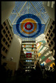
10/26/2007 10:20:20 PM |
| Wonderful use of desaturation! |
|
|
|
10/23/2007 04:32:28 AM |
| :-) I like it. Original and creative. I wish the "r" had even a bit more saturation to make it stand out even more. Good luck in the challenge. |
|
|
|
10/22/2007 01:01:25 PM |
| Nice use of desat and clever idea. |
|
|
|
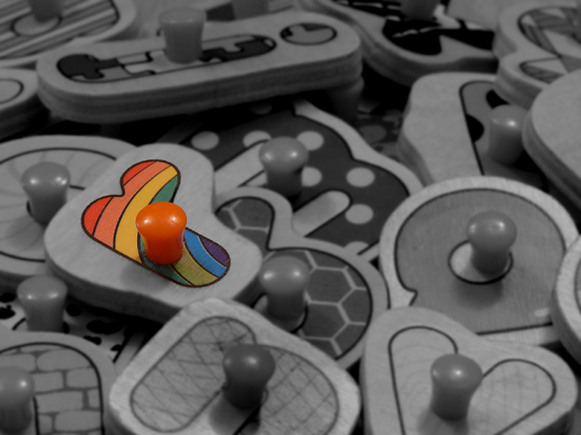
10/22/2007 08:54:47 AM |
For me, the black and white portions of the image really seem to bring this one down a bit. They seems so grey and drab. I realize that this is probably what you are going for, but the rainbow is not bright enough to conpensate. I think this image really needs an adjustment of the levels.
I hope you don't mind but I actually went in and looked at the histogram of this image. The image is whoafully underexposed. By just moving in the whites, the image really pops a lot more...
[thumb]603376[/thumb] |
|
|
|
10/22/2007 07:22:25 AM |
| Good find, and nicely executed! B/w was definitely the right choice. 10 |
|
Home -
Challenges -
Community -
League -
Photos -
Cameras -
Lenses -
Learn -
Help -
Terms of Use -
Privacy -
Top ^
DPChallenge, and website content and design, Copyright © 2001-2025 Challenging Technologies, LLC.
All digital photo copyrights belong to the photographers and may not be used without permission.
Current Server Time: 04/07/2025 01:56:25 PM EDT.