| Author | Thread |
|
|
02/25/2004 12:53:51 AM |
|
Comments Made During the Challenge  |
|
|
02/24/2004 06:36:57 PM |
|
|
|
02/24/2004 12:55:29 PM |
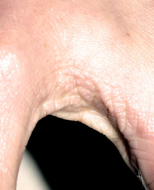
| I don't get this. Did you submit this by mistake? |
|
|
|
02/24/2004 11:48:37 AM |
| Way too hot... over-exposed skin rarely look good. Most of the "texture" has been blown away with the light. |
|
|
|
02/24/2004 09:16:07 AM |
| I have to 'hand' it to you! The lighting is to harsh for me, original idea though. |
|
|
|
02/23/2004 01:12:01 PM |
| Strangely disturbing, and I don't get the title, but it's a nice shot, and it fits the challenge well. 8 |
|
|
|
02/23/2004 01:30:12 AM |
| Interesting crop, but, highlights are overexposed. |
|
|
|
02/22/2004 05:42:26 PM |
| Weird title, distracting background, too many hot spots. |
|
|
|
02/22/2004 04:06:47 AM |
| I'm sure you are getting a lot of comments on this shot. Interesting! |
|
|
|
02/22/2004 01:32:55 AM |
| I really don't get the title??? |
|
|
|
02/20/2004 11:15:35 PM |
| ?, not sure is this a hand? |
|
|
|
02/20/2004 11:21:10 AM |
| This just looks kinda weird. Not sure I'll be able to sleep tonight. |
|
|
|
02/20/2004 02:05:49 AM |
| looks like a hand - quite badly exposed too. try a faster shutter speed. |
|
|
|
02/19/2004 09:24:36 AM |
|
|
|
02/19/2004 03:32:48 AM |
Too much flesh in the upper parts, and too much highlight (flash?)
Cropping off the top 50% of the image would make a difference to the composition. But I do not really understand this one. |
|
|
|
02/18/2004 10:10:54 AM |
|
|
|
02/18/2004 07:03:26 AM |
| Difficult to distinguish the subject.....and how it relates to texture..... the black and white background is confusing..... |
|
|
|
02/18/2004 06:24:14 AM |
| Hmmm...texture is there and that's all. LIghting is harsh, subject is lost on me and white in the background looks accidental. |
|
|
|
02/18/2004 05:50:31 AM |
|
|
|
02/18/2004 05:23:45 AM |
| Interesting composition and idea. :) Overexposure/hotspots detracts from image and shading for texture. Focus could have been better as well. |
|
|
|
02/18/2004 05:07:37 AM |
|
|
|
02/18/2004 03:29:28 AM |
| Front light tends to blow up textures as we can see here. Use lateral 45 or 90 degrees. |
|
|
|
02/18/2004 12:55:00 AM |
| Seriously ugly! :-) Way too much flash, completely killing any ambient light. White stripe in background an odd touch. properly lit the conjunction of thumb and finger could be interesting - like this, well poor work, I'm afraid. |
|
|
|
02/17/2004 08:33:12 PM |
| I applaud you for thinking outside of the box, on this, but I think bw would have helped to emphasize the texture more. |
|
|
|
02/17/2004 07:40:38 PM |
| I don't get your title with this photo. Great cature of skin texture, but lighting is a tad bright. |
|
|
|
02/17/2004 07:23:24 PM |
| you're title is awful man, and well...the photo isn't good either... |
|
Home -
Challenges -
Community -
League -
Photos -
Cameras -
Lenses -
Learn -
Help -
Terms of Use -
Privacy -
Top ^
DPChallenge, and website content and design, Copyright © 2001-2025 Challenging Technologies, LLC.
All digital photo copyrights belong to the photographers and may not be used without permission.
Current Server Time: 04/08/2025 01:32:59 AM EDT.