| Author | Thread |
|
|
10/22/2007 09:40:51 PM |
I like the choice in subject and the detail you were able to capture.
But to be honest, I think you missed the mark. The problem is the white/featureless background which is doing you no favors, IMO. Using it is like putting your subject under a microscope. It makes your subject look too clinical/analytical in appearance. Not only that but it robs the viewer of seeing this subject in it's proper context.
This is not to dismiss your opinion since as the author you can more easily connect with it but for the rest of us we need to see more, more context in which to identify and understand your vision. |
|
 Photographer found comment helpful. Photographer found comment helpful. |
Comments Made During the Challenge  |
|
|
10/19/2007 08:47:46 AM |
| I feel like it is missing something, perhaps would have like to see it in a sepia color. |
|
| Photographer found comment helpful. |
|
|
10/17/2007 07:17:03 AM |
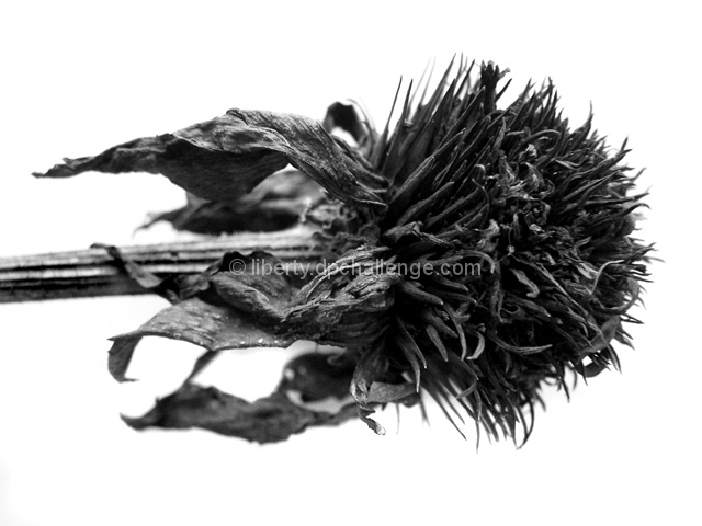
| Spent is the perfect word. I like it! |
|
| Photographer found comment helpful. |
|
|
10/15/2007 04:41:41 PM |
| The angle and dull b/w make this very uninteresting to look at. |
|
| Photographer found comment helpful. |
Home -
Challenges -
Community -
League -
Photos -
Cameras -
Lenses -
Learn -
Help -
Terms of Use -
Privacy -
Top ^
DPChallenge, and website content and design, Copyright © 2001-2025 Challenging Technologies, LLC.
All digital photo copyrights belong to the photographers and may not be used without permission.
Current Server Time: 04/07/2025 01:44:55 AM EDT.