| Author | Thread |
Comments Made During the Challenge  |
|
|
09/22/2002 05:15:00 PM |
| Very nice layering effect |
|
|
|
09/21/2002 11:09:00 PM |
| I saw a similar image in this quarter's Photographer's forum magazine. I loved it there and I love yours just as much. |
|
|
|
09/21/2002 06:05:00 AM |
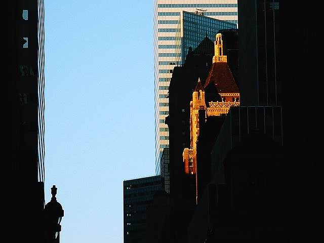
| I think I'd prefer it without the building on the left - great light though - makes me want to see the rest of the buildings so works very well |
|
|
|
09/20/2002 11:21:00 AM |
| Good attempt at contrasting the modern and the old. The NS in the composition does, in fact, embody the idea appropriately. |
|
|
|
09/20/2002 11:12:00 AM |
| my biggest criticism is that i see two pictures here, divide the picture vertically right down the middle and you have two nice pictures that both use neg space well |
|
|
|
09/19/2002 11:16:00 PM |
| I like how the one building has light on it. 5 |
|
|
|
09/19/2002 01:20:00 AM |
| Too much stuff here methinks |
|
|
|
09/18/2002 04:12:00 PM |
| so sweet 'cause the subject and the space are talking to each other. perfect focus and light. big fat ten. |
|
|
|
09/18/2002 07:58:00 AM |
Nice idea. Because the some buildings are in shadow I'm sort of seeing two competing areas of neg space, the black and the sky - and they aren't merging so it feels unbalanced. I know this is one of my least clear and least helpful comments, apologies. Articulate NOT!
5, Kavey |
|
|
|
09/18/2002 03:46:00 AM |
| A nice cityscape photograph. Usually they need more detail to be good, but your use of negative space adds to this one. |
|
|
|
09/17/2002 09:55:00 PM |
| For this challenge, I like this shot a lot. That one kind of gothic building just stands out brilliantly amont the sky scrapers and the reason it stands out so much is because of the shadows and forms of the space around it. |
|
|
|
09/17/2002 02:49:00 AM |
Composition: 4
Lighting: 4,
Appeal: 5, Total Rating 5 Sulamk
|
|
|
|
09/16/2002 07:30:00 PM |
|
|
|
09/16/2002 12:41:00 PM |
| very dramatic use of negative space..very crisp and I like the way the hi lights are balanced out by the negative space. |
|
|
|
09/16/2002 12:18:00 PM |
| There's just too much going on in this picture. I'm assuming your main subject is on the right with the glowing lights. Try and crop out what's on the left |
|
|
|
09/16/2002 11:13:00 AM |
| Interesting, and pulls me in. Nice job! Good luck in the challenge. Grayce aka Gracious |
|
|
|
09/16/2002 11:01:00 AM |
| Neat shot. Score 6 Justine |
|
|
|
09/16/2002 08:49:00 AM |
| I'd lose the stuff on the left, and straighten main vertical. |
|
|
|
09/15/2002 08:34:00 PM |
| nice pos/neg interplay. So far the trues to the challenge I have seen. 9 |
|
Home -
Challenges -
Community -
League -
Photos -
Cameras -
Lenses -
Learn -
Help -
Terms of Use -
Privacy -
Top ^
DPChallenge, and website content and design, Copyright © 2001-2025 Challenging Technologies, LLC.
All digital photo copyrights belong to the photographers and may not be used without permission.
Current Server Time: 04/06/2025 10:33:16 PM EDT.