| Author | Thread |
Comments Made During the Challenge  |
|
|
09/21/2002 07:55:00 PM |
| I like the contrasting colors in this. good work. karmat |
|
|
|
09/20/2002 10:28:00 PM |
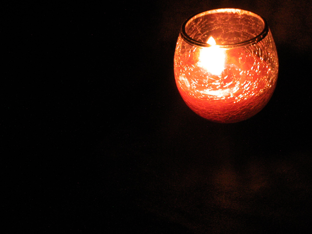
| That glass looks broken. I did that to one of my wifes candles. I tried to pick it up after I blew out the candle and it was too hot, so I put some water in the candle and it broke. Good lighting, I like the faint hint of a reflection. 6 |
|
|
|
09/20/2002 07:41:00 AM |
Nice detail in the glass and the light. Not sure that the positioning of the candle in the frame adds anything. Is it better or worse with the candle positioned differently or with different amounts of space? (I ask myself as much as I ask you).
I like the slight shadow/ reflection of red below the candle.
6, Kavey
|
|
|
|
09/19/2002 12:15:00 PM |
I'm being honest and straight forward - NOT to offend.
I like the idea, and the the black does bring out the color of the candle, however, imho, the large amount of 'neg space' is not needed and does not help the impact of the image. I don't know what this is about. My first reaction was...ok, it's a picture of a candle...but I don't get much more than that. I would say, look at the candle and try different angles with the camera, see what really works, what would set it apart from being 'just a photo of a candle'? The technical aspect is fine (I do see a hint of a red reflection, not sure if it is intentional) the technical execution is great. In no way is this meant to be offensive...only helpful..not that i'm an expert or anything 5
Ruthann |
|
|
|
09/17/2002 04:56:00 AM |
| Idea is solid. Focus is a little soft, which needs to be fixed if this photo is to have impact. Meets challenge. |
|
|
|
09/17/2002 04:36:00 AM |
| Well, there is definitely negative space here, but the photo lacks some "wow"! The flame thru the crackled glass is interesting, but it needs more. |
|
|
|
09/17/2002 03:06:00 AM |
Composition: 5
Lighting: 4
Appeal: 5, Total Rating 5 Sulamk
|
|
|
|
09/16/2002 11:24:00 AM |
|
|
|
09/16/2002 09:04:00 AM |
| Fits the bill. I do think the the perspective could of been better, this way it looks like the candle is falling. Still it's nice and right on target. Score 6 Justine |
|
|
|
09/16/2002 08:51:00 AM |
| This shot definitely shows negative space. I would love to know why you chose to position the candle in the upper right corner? I would also be interested in finding out if you tried this photo with the candle composed in different positions... I'm just curious... :) - jmsetzler |
|
|
|
09/16/2002 08:15:00 AM |
| I like the floating in space effect |
|
Home -
Challenges -
Community -
League -
Photos -
Cameras -
Lenses -
Learn -
Help -
Terms of Use -
Privacy -
Top ^
DPChallenge, and website content and design, Copyright © 2001-2025 Challenging Technologies, LLC.
All digital photo copyrights belong to the photographers and may not be used without permission.
Current Server Time: 04/09/2025 12:03:51 PM EDT.