| Author | Thread |
Comments Made During the Challenge  |
|
|
09/22/2002 11:04:00 AM |
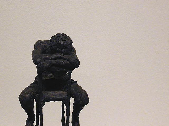
| Like the light background. Overall a bit dark, loosing detail of the sculpture. Why cut off the feet ? |
|
|
|
09/22/2002 07:56:00 AM |
Fotografia bella! This is a beautiful and beautifully simple photo. The statue itself evokes a number of emotions but when viewed in front of the stark white background it speaks volumes. I can't find any fault to this, but I honestly wouldn't look hard because it's so great. Congrats!
Score: 10
Courtenay |
|
|
|
09/21/2002 01:57:00 PM |
| Very nice idea. Slightly underexposed. Some sharpening artifacts. And I am compelled to see the last 3% of the subject which is out-frame to the bottom left. |
|
|
|
09/21/2002 08:21:00 AM |
I think the composition works well for this shot but the lighting means I find it hard to pull out the detail in the wonderful sculpture. I am not sure the choice of background adds anything, I personally don't like it's texture against that of the sculpture. Just my personal tastes though.
7, Kavey |
|
|
|
09/20/2002 12:05:00 PM |
| I like the textures shown here, and the simple colors. karmat |
|
|
|
09/18/2002 10:18:00 PM |
| that is a wierd sculpture. It looks like he got in trouble. 5 |
|
|
|
09/17/2002 11:11:00 AM |
| where are the feet? what does the negetive space tell me about the subject and vice versa? |
|
|
|
09/17/2002 10:10:00 AM |
| excellent. and i like the title. however, i wish you had pushed the levelsto bring out a little more contrast. 7. mag99 |
|
|
|
09/17/2002 02:37:00 AM |
Composition: good butyou appear to have used a bit to much unsharp mask as there is a halo around your figure the background is a bit noisy 6 Lighting: 5,
Appeal: 6 Total Rating 6 Sulamk
|
|
|
|
09/16/2002 04:40:00 PM |
| Would like to have seen his feet, but this definitely meets the challenge. |
|
|
|
09/16/2002 02:16:00 PM |
| nice use of - space. did u have to crop the feet? |
|
|
|
09/16/2002 01:57:00 PM |
| I like the shape, I like the subtle texture and colour as background. Was it not possible the include the feet ? They look cut off, but it might be the sculpture. |
|
|
|
09/16/2002 11:14:00 AM |
| where's the negative space ?? |
|
|
|
09/16/2002 07:06:00 AM |
| Not crazy that his feet are cut off. Score 6 Justine. |
|
Home -
Challenges -
Community -
League -
Photos -
Cameras -
Lenses -
Learn -
Help -
Terms of Use -
Privacy -
Top ^
DPChallenge, and website content and design, Copyright © 2001-2025 Challenging Technologies, LLC.
All digital photo copyrights belong to the photographers and may not be used without permission.
Current Server Time: 04/09/2025 09:04:15 AM EDT.