| Author | Thread |
Comments Made During the Challenge  |
|
|
09/22/2002 06:29:00 PM |
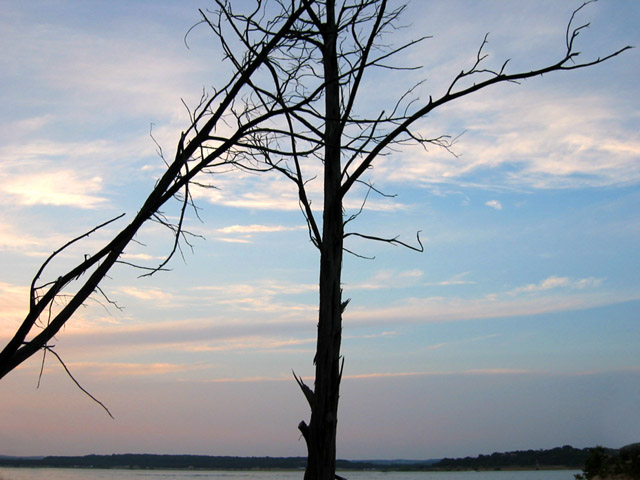
| I don't think the fallen tree adds to meeting the challenge. From the lighting, I think I'd have moved to the right (if possible) and made the two trunks line up more tightly. I shoot a lot of sunsets and trees myself -- keep shooting as many as you can, they are worth every megabyte! |
|
 Photographer found comment helpful. Photographer found comment helpful. |
|
|
09/21/2002 02:39:00 PM |
|
|
|
09/20/2002 09:51:00 PM |
| The tree on the left is a little distracting coming into the picture. I ilke the begining of the sunset. 5 |
|
| Photographer found comment helpful. |
|
|
09/20/2002 11:45:00 AM |
| I like the silhouette of the trees. I think if you had cropped out the horizon, it would force even more attention to them, though. karmat |
|
| Photographer found comment helpful. |
|
|
09/20/2002 08:21:00 AM |
| The beginning of a good subject. Good color range. Focus a little soft, and the subject is not isolated as well as could be. 5.5 -> 6 |
|
| Photographer found comment helpful. |
|
|
09/19/2002 03:28:00 AM |
| lovely scenic shot good silhoettes and colours |
|
|
|
09/18/2002 03:47:00 AM |
| I always love tree branch shots. Very pretty. |
|
|
|
09/18/2002 03:15:00 AM |
| I would have liked this more if the was just the one tree in the shot. The lighting is good and your sky looks really nice. 6-Martin |
|
| Photographer found comment helpful. |
|
|
09/17/2002 10:34:00 PM |
i like the colors in the sky. nice sillouette
|
|
|
|
09/17/2002 01:07:00 PM |
| Nice background. I like the idea, but I would have cropped the horizon out of thepicture to make it appear more abstract. |
|
|
|
09/17/2002 07:47:00 AM |
| This is interesting, because i think I would like this photo MUCH more if the tree wasn't in it :) - jmsetzler |
|
|
|
09/17/2002 01:06:00 AM |
Composition: 6
Lighting: 5,
Appeal: 6, Total Rating 6 Sulamk
|
|
|
|
09/16/2002 04:31:00 PM |
|
|
|
09/16/2002 02:04:00 PM |
| i was going to give my first 10 so far when i saw the picture loading, but when it got to the bottom and the land was showing it took away from the overall feel of the picture. if the land were cropped i would have given you a 10 for sure. |
|
| Photographer found comment helpful. |
|
|
09/16/2002 12:19:00 PM |
| That's a nice silhouette, but the negative space is lacking |
|
|
|
09/16/2002 11:14:00 AM |
| I think would of helped this to crop more off the bottom and show the top of the trees. Just MHO. :) Good luck. Score 6 Justine |
|
|
|
09/16/2002 01:49:00 AM |
| I like this, but I think the lines of the tree would be stronger if you'd stepped to the left and had the diagonal tree more across the middle, and the other tree over to the right. Hope I'm making sense, it's early. :) |
|
| Photographer found comment helpful. |
|
|
09/16/2002 12:04:00 AM |
|
Home -
Challenges -
Community -
League -
Photos -
Cameras -
Lenses -
Learn -
Help -
Terms of Use -
Privacy -
Top ^
DPChallenge, and website content and design, Copyright © 2001-2025 Challenging Technologies, LLC.
All digital photo copyrights belong to the photographers and may not be used without permission.
Current Server Time: 04/06/2025 10:32:51 PM EDT.