| Author | Thread |
Comments Made During the Challenge  |
|
|
09/21/2002 05:04:00 PM |
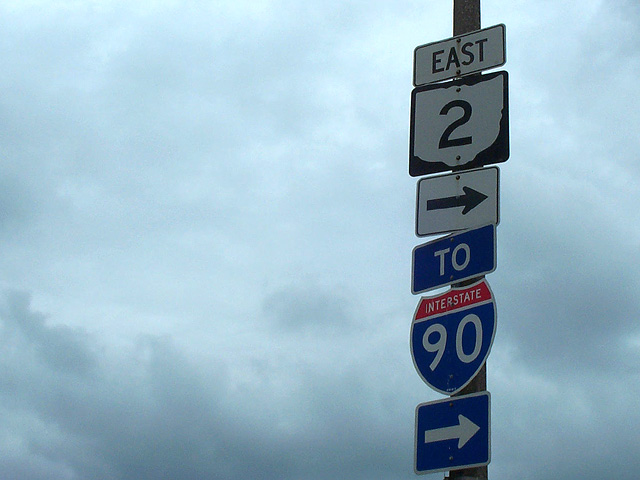
| I like the concept. I think this type of photo, perhaps with signs that contradict each other in some manner would be very interesting. Its hard to put an emphasis on negative space and keep the photo interesting, which means the subject needs to be extraordinary all by itself. Nice shot though -8 |
|
|
|
09/21/2002 11:57:00 AM |
| to me this screams for a vertical framing |
|
|
|
09/21/2002 02:29:00 AM |
| Nice sky. This one doesn't appeal to me that much. 5 |
|
|
|
09/20/2002 02:51:00 PM |
| Idea is solid. Uncooperative sky, though. The metering mode in your camera caused the signs to underexpose. If you can, you can set metering for center weighted, center focus on the signs (thus metering them properly), reframe, and fully depress your shutter to shoot. Also, you might get better color if you calibrate your auto white balance against the clouds in the sky, as they are your radiant light source. Whew! that's a mouthful! - mjcecil |
|
|
|
09/20/2002 01:30:00 PM |
| not the best example of neg space, not the worst. |
|
|
|
09/19/2002 03:37:00 AM |
| The clouds in the sky are good, but the quality on my pc doesn't look that great. I am sure it looks better and less grainy? |
|
|
|
09/18/2002 06:02:00 PM |
| Overall, I like the colors, and the texture of the clouds in the sky, but it seems a little flat to me for some reason. Maybe a different perspective? karmat |
|
|
|
09/18/2002 04:00:00 PM |
| This is kinda like my shot this week, only better. I like it. |
|
|
|
09/17/2002 06:51:00 AM |
Composition: 5Lighting: good 5,
Appeal: 5, Total Rating 5 Sulamk
|
|
|
|
09/16/2002 09:58:00 PM |
| Washington state, I presume! |
|
|
|
09/16/2002 04:11:00 PM |
|
|
|
09/16/2002 03:49:00 PM |
| Clever, creative idea. I like it. Maybe a bit dark. Score 6 Justine |
|
|
|
09/16/2002 08:32:00 AM |
| just a suggestion... see how the arrows are all pointing to the right... try leaving the large space to the right. it'll help for impact. |
|
Home -
Challenges -
Community -
League -
Photos -
Cameras -
Lenses -
Learn -
Help -
Terms of Use -
Privacy -
Top ^
DPChallenge, and website content and design, Copyright © 2001-2026 Challenging Technologies, LLC.
All digital photo copyrights belong to the photographers and may not be used without permission.
Current Server Time: 02/01/2026 05:22:44 AM EST.