| Author | Thread |
|
|
03/27/2008 01:35:49 AM |
Originally posted by booboo_goon:
Dude!! I felt like you didn't like my comment? I loved this shot gave it a 10!! But the frame does spoil the picture, that's a completly different matter... lol |
Thanks. |
|
|
|
09/26/2007 07:20:58 AM |
| Dude!! I felt like you didn't like my comment? I loved this shot gave it a 10!! But the frame does spoil the picture, that's a completly different matter... lol |
|
Comments Made During the Challenge  |
|
|
09/25/2007 08:39:31 PM |
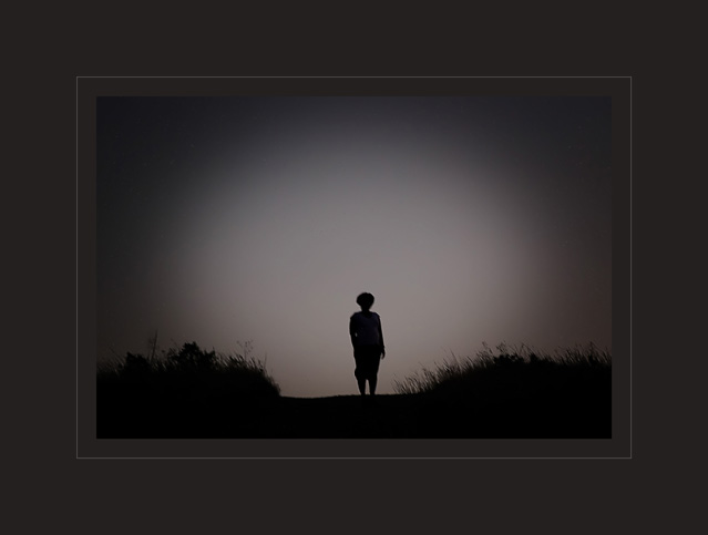
| Not quite sure about the frame, or the dodge/burn. |
|
|
|
09/23/2007 10:31:06 AM |
| This is a great shot, i think less border might help though |
|
 Photographer found comment helpful. Photographer found comment helpful. |
|
|
09/23/2007 09:27:49 AM |
| Nice work! Simple but effective. 10 |
|
| Photographer found comment helpful. |
|
|
09/23/2007 03:50:20 AM |
| I love the frame, though I imagine many dpcers will not...I hope this is legal editing as the vignetting is really strong but suited... I love this for its simplicity, tones and frame 9 |
|
| Photographer found comment helpful. |
|
|
09/22/2007 04:31:43 PM |
| The border is way too wide. |
|
|
|
09/21/2007 08:16:30 PM |
And like a moth that tries to enter the bright light, I go shuffling out of life, just to hide in death a while. And anyway I never lied! -Nick Cave
Reminded me of that :p |
|
| Photographer found comment helpful. |
|
|
09/21/2007 05:29:06 PM |
| Haha, lol... this photo reminds me of a scene from ET. |
|
| Photographer found comment helpful. |
|
|
09/21/2007 01:32:03 PM |
| I think you might be DQ'd with that large border. It is a cool photo though. It would have been so much more effective if the photo was larger and that extra border was removed. |
|
| Photographer found comment helpful. |
|
|
09/20/2007 10:29:14 AM |
| This is interesting... I like it, but what's with the border being bigger than the picture?! Unecessary in my opinion BUT I love the subject here and the composition =) |
|
| Photographer found comment helpful. |
|
|
09/20/2007 03:23:59 AM |
| very low key image, the strong vigneting plus the giant border do not add to the composition, although is decently balanced. |
|
| Photographer found comment helpful. |
|
|
09/19/2007 06:39:17 PM |
| creepy, great idea, but it seems out of focus. |
|
| Photographer found comment helpful. |
|
|
09/19/2007 02:03:29 PM |
| This looks like it should have some sort of scripture at the bottom, very nice. Love the mellow tones. |
|
| Photographer found comment helpful. |
|
|
09/19/2007 11:10:49 AM |
| This would be better without the frame. |
|
|
|
09/19/2007 09:04:17 AM |
|
| Photographer found comment helpful. |
|
|
09/19/2007 05:34:30 AM |
|
| Photographer found comment helpful. |
|
|
09/19/2007 02:34:09 AM |
WOW his is incredible love the borders!
its just such a nice picture!
i would so have this up on my wall!
you should make prints of it. great photo this is going to do good. i can tell |
|
| Photographer found comment helpful. |
|
|
09/19/2007 01:34:18 AM |
| I wish this gets a ribbon, it is truly awesome. |
|
| Photographer found comment helpful. |
Home -
Challenges -
Community -
League -
Photos -
Cameras -
Lenses -
Learn -
Help -
Terms of Use -
Privacy -
Top ^
DPChallenge, and website content and design, Copyright © 2001-2026 Challenging Technologies, LLC.
All digital photo copyrights belong to the photographers and may not be used without permission.
Current Server Time: 02/01/2026 08:55:25 AM EST.