| Author | Thread |
|
|
09/24/2007 12:39:16 AM |
|
 Photographer found comment helpful. Photographer found comment helpful. |
Comments Made During the Challenge  |
|
|
09/23/2007 03:20:08 PM |
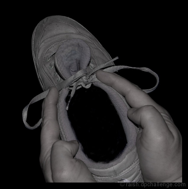
| The elements in the photo are nice & sharp but the composition as a whole needs work in a few areas for it to really shine. I find it odd how the bottom of the shoe & hands are cut off with a sharp edge of blackness at the bottom. A black border? It doesn't add anything to the the composition and in fact detracts and calls attention to the chopped portion. One of the things that makes the original really stand out is that the hands holding that shoe in a silent scream gesture is that they seem to emerge out of the darkness. In this composition you are way too close for us to fully recognize the gesture & pose of the elements mimicking Munch's Scream. The full details of the shoe and hand are front row and center. Pull back and have them emerge from the darkness so that we see the gesture & pose of the scream more than the possible brand of the shoe. The other thing is that your B&W tones are flat and lack good contrast. Playing around with the Brightness/Contrast Adjustment level and bring up the contrast. You may also have to do some dodging and burning to increase the difference of light and dark areas in your main subject to really *pop* visually. |
|
| Photographer found comment helpful. |
|
|
09/23/2007 11:58:12 AM |
| You really should have said "The Scream by dsidwell or image 463846. If there hadn't been another in the challenge I would have never figured out an original. Not as good a copy as the other either. Good attempt though. |
|
| Photographer found comment helpful. |
|
|
09/22/2007 02:48:35 AM |
| Very hard to recreate the original of this one. Credit for trying but there is too much detail present to give the illusion of the 'scream'. Hope this makes sense. Compare it side by side with the original and I think you will see. Thumbnail shows the difference particularly well. 4 |
|
| Photographer found comment helpful. |
|
|
09/21/2007 09:34:48 AM |
| Compared to the original, you have too much of the shoe showing. The original had the perfect angle, that cause you to have to take a second look to ealize that it was a shoe. And the lighting? Unfortuantely you have too much. |
|
| Photographer found comment helpful. |
|
|
09/19/2007 02:43:08 AM |
| Good attempt but needs more contrast. |
|
| Photographer found comment helpful. |
|
|
09/17/2007 01:38:50 PM |
| sorry, doesn't work for me. lighting is completely different, as is the position of the laces and the crop. |
|
| Photographer found comment helpful. |
|
|
09/17/2007 05:59:55 AM |
| didn't get that one to work very well, did we? |
|
| Photographer found comment helpful. |
|
|
09/17/2007 05:02:21 AM |
| For a reason in looks better in the thumbnail, when opened is difficult to see the face! |
|
| Photographer found comment helpful. |
Home -
Challenges -
Community -
League -
Photos -
Cameras -
Lenses -
Learn -
Help -
Terms of Use -
Privacy -
Top ^
DPChallenge, and website content and design, Copyright © 2001-2026 Challenging Technologies, LLC.
All digital photo copyrights belong to the photographers and may not be used without permission.
Current Server Time: 02/01/2026 08:59:09 AM EST.