| Author | Thread |
|
|
09/23/2002 04:19:00 PM |
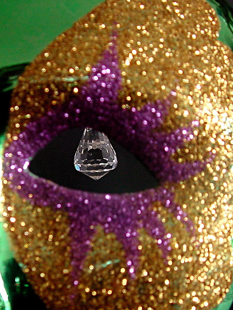
| Swash, I think the problem is that you got so close people couldn't identify what they were looking at. A plain green glass might have been better for defineing the eye hole and setting off the stone. Was definetly an eye catcher. |
|
 Photographer found comment helpful. Photographer found comment helpful. |
|
|
09/23/2002 03:59:00 PM |
The photo was supposed to Wow you. I thought the mask (the green, gold and purple part of the picture) were pretty wow. The crystal was THE subject. The eye hole was the negative space, the mask was just there to give the eye hole something to be an eye hole IN. I thought viewers would see the crystal clear crystal and KNOW it was the subject. I did not want the mask in focus, as it was NOT the subject.
I really thought this was my most artistic piece to date and I always try to meet the challenge as straight forward as possible.
22 ONE votes and 32 TWO votes say alot to me. I missed the mark. It's still one of my fav shots. Swash |
|
Comments Made During the Challenge  |
|
|
09/22/2002 04:38:00 PM |
| Although I can't quite make this out too well I like it as an abstract. Good luck in the challenge! Grayce aka Gracious |
|
| Photographer found comment helpful. |
|
|
09/22/2002 02:30:00 PM |
| This is great but needs background different than green, I believe. |
|
|
|
09/22/2002 07:19:00 AM |
| your negative space is a bit overwhelming |
|
| Photographer found comment helpful. |
|
|
09/21/2002 10:42:00 PM |
| I'm not sure what that is. I like the detail on the crystal thing. It just doesn't have that much appeal to me. 5 |
|
| Photographer found comment helpful. |
|
|
09/21/2002 01:44:00 PM |
| Not sure how the mask constitutes negative space, as the mask is central to the idea, as a window frame might be. |
|
| Photographer found comment helpful. |
|
|
09/20/2002 10:49:00 AM |
| interesting. did you try a horizontal framing with this, and if so, how did it look? karmat |
|
| Photographer found comment helpful. |
|
|
09/20/2002 06:17:00 AM |
| Being the slow person that I am, it took me a minute to realize that this was a mask. Duh. I think that the photo might look better if the mask was just a bit more out of focus. I would have also moved the crystal back just a bit more. I'd like to see just a bit more of it. I like the overall effect of this image. waltoml 7 |
|
| Photographer found comment helpful. |
|
|
09/19/2002 11:03:00 AM |
| Too much brightness. Good definition, brilliance. |
|
| Photographer found comment helpful. |
|
|
09/17/2002 01:20:00 AM |
| I've seen a few of these from this perspective. This is pretty well done though. |
|
| Photographer found comment helpful. |
|
|
09/16/2002 10:21:00 PM |
Composition: 6 Lighting: good 5,
Appeal: 5, Total Rating 6 |
|
| Photographer found comment helpful. |
|
|
09/16/2002 09:29:00 PM |
| This is hard on the eyes. I'm not sure what it is, either. |
|
|
|
09/16/2002 11:58:00 AM |
| Interesting :) I'm not really sure how to comment on this one... The negative space would seem to be the area around the gem stone? - jmsetzler |
|
| Photographer found comment helpful. |
|
|
09/16/2002 09:10:00 AM |
| Not too keen for the focus here or the subject. Pretty colors. Score 5 Justine |
|
| Photographer found comment helpful. |
|
|
09/16/2002 04:24:00 AM |
| I dont see very much negative space. Too much going on. |
|
| Photographer found comment helpful. |
|
|
09/15/2002 11:22:00 PM |
| has lots of fuzzy wow......... |
|
Home -
Challenges -
Community -
League -
Photos -
Cameras -
Lenses -
Learn -
Help -
Terms of Use -
Privacy -
Top ^
DPChallenge, and website content and design, Copyright © 2001-2025 Challenging Technologies, LLC.
All digital photo copyrights belong to the photographers and may not be used without permission.
Current Server Time: 04/08/2025 04:44:42 AM EDT.