| Author | Thread |
|
|
09/03/2009 10:51:12 PM |
| a wonderful photograph .. just brilliant .. :) |
|
 Photographer found comment helpful. Photographer found comment helpful. |
|
|
10/05/2007 11:25:14 AM |
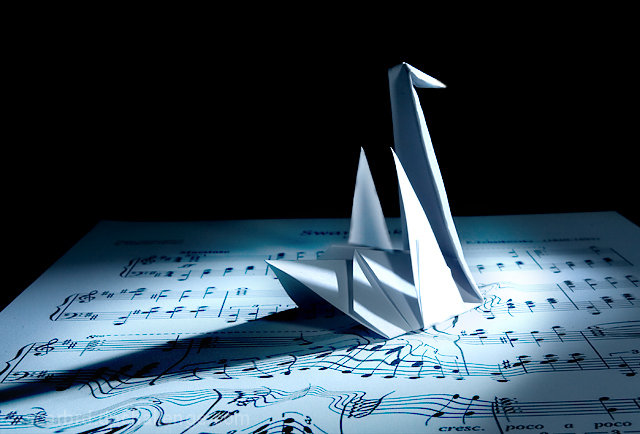
| it's clear, it's sharp, the lighting it perfect, and i love the way to paper moved to signify a swimming swan in water, so amazing... |
|
| Photographer found comment helpful. |
|
|
09/25/2007 09:30:59 AM |
Hi David,
wonderful job you did here. Congrats! |
|
| Photographer found comment helpful. |
|
|
09/23/2007 10:13:38 PM |
| Excellent job David...a nice finish...you really pulled it off |
|
| Photographer found comment helpful. |
Comments Made During the Challenge  |
|
|
09/23/2007 07:33:26 PM |
|
| Photographer found comment helpful. |
|
|
09/21/2007 04:31:20 PM |
| the lighting is wonderful - 10 |
|
| Photographer found comment helpful. |
|
|
09/20/2007 09:08:27 AM |
| needs a bit of sharpness compared to the original. Exellent take on it though:D |
|
| Photographer found comment helpful. |
|
|
09/19/2007 09:32:21 PM |
| The control of light isn't as good as the original but still pretty good. I prefer this one over the other in the challenge like it. |
|
| Photographer found comment helpful. |
|
|
09/19/2007 08:36:20 PM |
| Another good 'copy'. I think DeSousa's had a little more blue but both are very good. 9 |
|
| Photographer found comment helpful. |
|
|
09/19/2007 04:09:39 PM |
| Nicely done emulation of De Sousa's Swan Lake. The musical wake as the swan 'swims' past is what really makes the both compositions demand our attention and play with our imagination. I cannot be sure if the sheet music you used is from Swan Lake - I certainly hope so for that would strengthen the composition. Lighting is good but could be better as that there is a bit of harsh spotlight just right in front of the swan that is a bit blown out. Perhaps diffusing the light with a white cloth a few inches away from the main light would cut the glare down. Your photo composition has a bit more of a bluish cast to it. I'm not quite sure if it is a positive or negative. I do like the more crisp natural light in the original but the bluish cast in yours can be seen as a nice touch for it does give a subtle nod to the color of water. |
|
| Photographer found comment helpful. |
|
|
09/19/2007 12:10:14 PM |
| Best effort in duplicating the moving water distortion on the music scale. I also love the spot lighting. Excellent. |
|
| Photographer found comment helpful. |
|
|
09/19/2007 06:19:38 AM |
|
| Photographer found comment helpful. |
|
|
09/19/2007 06:04:51 AM |
| Great idea it comes together VERY well! |
|
| Photographer found comment helpful. |
|
|
09/18/2007 10:54:47 PM |
|
| Photographer found comment helpful. |
|
|
09/18/2007 01:52:48 PM |
| best of the birdies...(no vote) |
|
| Photographer found comment helpful. |
|
|
09/18/2007 01:31:45 PM |
| WOW its SO close!! I love it! this was one of my favorite shots form that shoot, the paper seems a bit blown out at the tip of the swan |
|
| Photographer found comment helpful. |
|
|
09/17/2007 06:08:36 PM |
| Best of the swan duplicates - looks exactly like the original. |
|
| Photographer found comment helpful. |
|
|
09/17/2007 02:38:06 PM |
| Very well done! You obviously studied the original closely. |
|
| Photographer found comment helpful. |
|
|
09/17/2007 01:11:47 PM |
| While others in the challenge set out to do the same tribute shot, yours is spot on! Bravo to you, nicely done! *8* |
|
| Photographer found comment helpful. |
|
|
09/17/2007 09:57:23 AM |
|
| Photographer found comment helpful. |
|
|
09/17/2007 09:20:50 AM |
| Wow! A Perfect replica. Great job. |
|
| Photographer found comment helpful. |
|
|
09/17/2007 09:18:11 AM |
You almost have the drama of the shadow, but just not quite. The sharpness of the original is also lacking.
Don't get me wrong, I like this, but it just shows how hard the deja vu challenges are. |
|
| Photographer found comment helpful. |
|
|
09/17/2007 01:21:58 AM |
|
| Photographer found comment helpful. |
|
|
09/17/2007 01:01:27 AM |
| not as sharp an image as the original. |
|
| Photographer found comment helpful. |
|
|
09/17/2007 12:27:57 AM |
| Lacks a bit of DOF, compared to the original, but I like the distortions on your note sheet better. color is a bit too "aqua" |
|
| Photographer found comment helpful. |
Home -
Challenges -
Community -
League -
Photos -
Cameras -
Lenses -
Learn -
Help -
Terms of Use -
Privacy -
Top ^
DPChallenge, and website content and design, Copyright © 2001-2025 Challenging Technologies, LLC.
All digital photo copyrights belong to the photographers and may not be used without permission.
Current Server Time: 04/07/2025 01:23:22 AM EDT.