| Photograph Information |
Photographer's Comments |
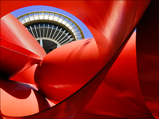
Challenge: Deja Vu III (Advanced Editing V*)
Camera: Nikon D200
Lens: Nikon AF-S Zoom-Nikkor 24-120mm f/3.5-5.6G IF-ED VR
Location: Seattle Washington, USA
Date: Sep 10, 2007
Aperture: F/29
ISO: 640
Shutter: 1/80
Galleries: Cityscape, Digital Art
Date Uploaded: Sep 10, 2007
|
Photographer’s Notes
Emulating the following Photo:
• Challenge: Curves
• Date: April 2002
• Title: Needle in Red
• Photographer: timj351 (Tim Jensen)
• Camera: Sony DSC-F707
• Aperture: F/5.6
• ISO: 400
• Shutter: 1/500
• Editing: Classic
For the record, Tim is a 9-ribbon-winner and a kind-of-a-sort-of-a-neighbor, which is to say we live in the same state less than 30 miles apart, but don’t know each other. He’s a fine photographer and it was a thrill for me to stand exactly where he stood, and capture exactly the subject he captured.
Obviously, these images were taken at different times of the day. The lighting and light direction are somewhat different. This is September. The original was taken in April. Get over it. If you divide our images in half … I like my right half better than his, and I like his left half better than mine.
This was fun … thanks, Tim, for the inspiration!
Also, Tim, I just hope I will get something close to your original score, which was awesome!
Post Processing
• Match Tim’s color scheme (Match Color)
• Correct color (Curves Layer)
• Match Tim’s Sky (Hue/Saturation 1 Layer)
• Remove Dirt from the Sculpture (Clone Stamp)
• Dodge & Burn (Overlay Layer)
• Mid-tone Contrast; Needle (Curves Layer)
• Reduce Blown Highlight (Curves, H/S, Clone)
• Resize (Bi-cubic sharper)
• Add minimal Border (Select All & Stroke)
• Save for Web
Camera Data
• Nikon D200
• 2005/09/10 12:50:03.4
• JPEG (8-bit) Fine
• Image Size: Large (3872 x 2592)
• Color
• Lens: VR 24-120mm F/3.5-5.6 G
• Focal Length: 45mm
• Exposure Mode: Aperture Priority
• Metering Mode: Center-Weighted
• 1/80 sec - F/29
• Exposure Comp.: 0 EV
• Sensitivity: ISO 640
• Optimize Image: Vivid
• White Balance: Auto
• AF Mode: AF-S
• Flash Sync Mode: Not Attached
• Color Mode: Mode III (Adobe RGB)
• Tone Comp.: Normal
• Hue Adjustment: 0°
• Saturation: Enhanced
• Sharpening: Medium high
• Image Comment:
• Long Exposure NR: Off
• High ISO NR: On (Normal) |
| Author | Thread |
Comments Made During the Challenge  |
|
|
09/23/2007 07:20:36 PM |
|
 Photographer found comment helpful. Photographer found comment helpful. |
|
|
09/23/2007 07:33:42 AM |
| A definite improvement on the original�..10 |
|
| Photographer found comment helpful. |
|
|
09/23/2007 05:53:39 AM |
| Different lighting, but otherwise identical. Very good. |
|
| Photographer found comment helpful. |
|
|
09/22/2007 10:56:24 PM |
| I had not seen this image before. So firstly...thankyou for bringing it to my attention. Secondly...I feel your version is a stronger image. Good work. |
|
| Photographer found comment helpful. |
|
|
09/21/2007 08:19:15 AM |
| A wonderful emulation on the original! Love the flow of shapes and colors in both this one and the original. Love how you got the angle just right to replicate the sweep of the curve that cuts diagonally across the image from left to right. Colors are bold and vibrant and sharpness is spot on! Well done. |
|
| Photographer found comment helpful. |
|
|
09/20/2007 04:08:38 PM |
| Excellent framing. I could see this on a wall somewhere. 7 |
|
| Photographer found comment helpful. |
|
|
09/20/2007 03:23:39 PM |
| Better than the original. |
|
| Photographer found comment helpful. |
|
|
09/19/2007 03:05:29 PM |
| Guess what? You win the matchup against Tim. I like the reds of yours over the orangishness of his and yours is much, much sharper. |
|
| Photographer found comment helpful. |
|
|
09/18/2007 09:12:17 AM |
| a tad better than the original (blame it on the camera) |
|
| Photographer found comment helpful. |
|
|
09/17/2007 10:14:48 AM |
| Even better then the original! Whilst I like this a lot I don't think it's as interesting as some of the other entries. A solid entry though |
|
| Photographer found comment helpful. |
|
|
09/17/2007 04:00:10 AM |
|
| Photographer found comment helpful. |
|
|
09/17/2007 12:28:34 AM |
| very close. shadows are all wrong, yours is a little "reder" as the original looks orange next to yours. (i like yours better) |
|
| Photographer found comment helpful. |
Home -
Challenges -
Community -
League -
Photos -
Cameras -
Lenses -
Learn -
Help -
Terms of Use -
Privacy -
Top ^
DPChallenge, and website content and design, Copyright © 2001-2025 Challenging Technologies, LLC.
All digital photo copyrights belong to the photographers and may not be used without permission.
Current Server Time: 04/07/2025 01:34:41 AM EDT.