| Author | Thread |
|
|
02/12/2004 07:04:00 AM |
In response to your request for comments:
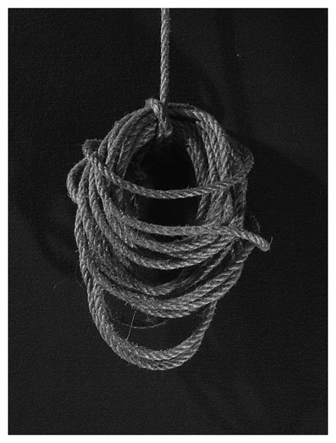
It's simple, but to me seems a bit 2-dimensional (perhaps if you shot it closer or maybe this one would have worked better in color). The centered composition doesn't work well for me because the rope is not symmetrical (in fact it looks a bit tilted/lopsided, and the centered composition highlights that.). I have never tried a rope shot, so it's harder for me to describe what would have worked better compositionally, but I have seen some that really had impact on me, so perhaps you can search for ones that strike you around here, and on PhotoPoints (where I think I've seen some really good ones). |
|
 Photographer found comment helpful. Photographer found comment helpful. |
Comments Made During the Challenge  |
|
|
02/09/2004 05:09:10 AM |
| The tone is good, it's just dark enough to show the details and textures of the rope. I'm wondering if this was shot a little too close to the background material as the background seems to have some texture too, or it could be the wisps from the rope. Almost looks like a noose! |
|
| Photographer found comment helpful. |
|
|
02/07/2004 05:27:54 PM |
| Nice composition, great choice of B&W |
|
|
|
02/06/2004 03:40:32 AM |
|
|
|
02/05/2004 09:58:45 AM |
|
|
|
02/04/2004 11:57:32 PM |
| It's a good simple image, but it needs more contrast to make the background black. |
|
| Photographer found comment helpful. |
|
|
02/03/2004 08:30:10 PM |
| I believe it is called 'coiled up' in marine terms. Simplicity and elegance. The frame is a bit too light. |
|
|
|
02/03/2004 07:28:34 PM |
Simply nice. Good Frame. What was your light Source.
|
|
Home -
Challenges -
Community -
League -
Photos -
Cameras -
Lenses -
Learn -
Help -
Terms of Use -
Privacy -
Top ^
DPChallenge, and website content and design, Copyright © 2001-2025 Challenging Technologies, LLC.
All digital photo copyrights belong to the photographers and may not be used without permission.
Current Server Time: 04/07/2025 12:59:52 PM EDT.