| Author | Thread |
|
|
09/12/2007 06:39:49 AM |
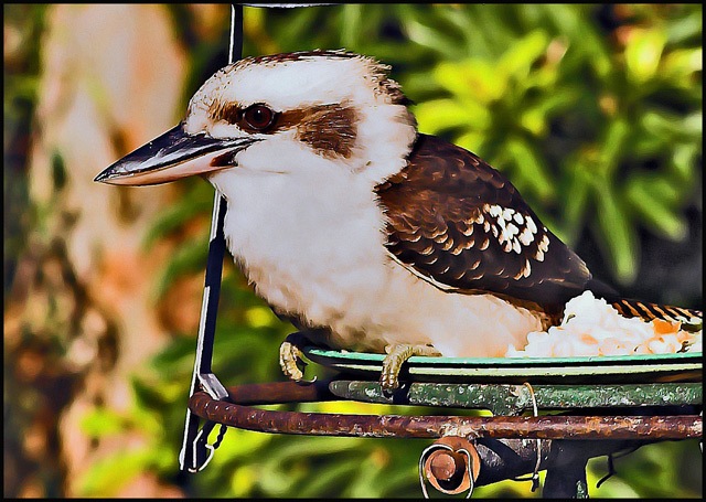
| hey shez, a nice shot. however, i think agree with the comments about the processing. you have a very recognizable, signature style that works very well on most of your images. however, here, with the detail in the bird and other textures, it seems a bit much. i'd like to see with a little less smoothing |
|
 Photographer found comment helpful. Photographer found comment helpful. |
Comments Made During the Challenge  |
|
|
09/11/2007 06:23:40 PM |
|
| Photographer found comment helpful. |
|
|
09/11/2007 04:22:50 PM |
| Seems to me that you use a bit to much contrast resulting in white lines beside the dark ones. |
|
| Photographer found comment helpful. |
|
|
09/11/2007 03:24:29 AM |
| Nicely balanced composition, but the high-contrast paint-brush filter hasn't really worked well here. |
|
| Photographer found comment helpful. |
|
|
09/09/2007 08:49:33 PM |
| not so crazy about the pp |
|
| Photographer found comment helpful. |
|
|
09/06/2007 10:01:04 AM |
| This seems very contrasty and a bit ovesharpened perhaps |
|
| Photographer found comment helpful. |
|
|
09/05/2007 08:27:56 PM |
| I think you overcooked this in post-processing. |
|
| Photographer found comment helpful. |
|
|
09/05/2007 06:56:10 PM |
| I think a bit too bright, but such a nice close-up! |
|
| Photographer found comment helpful. |
|
|
09/05/2007 06:47:40 AM |
Composition: Subject Placement, Cropping, Background good,
Technical: Focus, Exposure: good, but a bit too sharp
Appeal:nice close up, good focal point
Total Averaged Rating 6. |
|
| Photographer found comment helpful. |
Home -
Challenges -
Community -
League -
Photos -
Cameras -
Lenses -
Learn -
Help -
Terms of Use -
Privacy -
Top ^
DPChallenge, and website content and design, Copyright © 2001-2025 Challenging Technologies, LLC.
All digital photo copyrights belong to the photographers and may not be used without permission.
Current Server Time: 04/07/2025 02:03:12 PM EDT.