| Author | Thread |
|
|
02/14/2004 11:51:06 PM |
Greetings from the Critique Club[/b
[b]Initial thoughts/My opinion
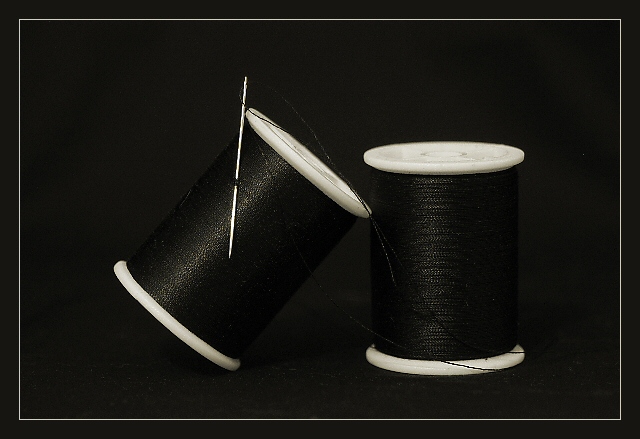
Great clear concept well executed. Like the shininess of the thread. The needle suffers from artifacts. Was surprised to see a German title!
Content/Composition
I do like how you arranged the few elements of your image: very clear and right on the topic. The way you set the light is just great: the reflection on the thread make the image. What amazes me is the levels curve of this image: almost only dark black and just a few bright elements. There are not many shades of gray in it. I do like that.
As mentioned by you, the needle does stand back against the rest and it suffers from jaggiest coming from the down-sizing.
Camera work -technically
You know how to handle your camera, can't see anything to need mentioning here.
Digital Processing - Technical
As already said, the needle does not come out too good due to the jaggies on it. A tighter crop might have worked here; however, the image balance would have been disturbed.
Fits the challenge
Yes, it fits very well.
Good luck for your upcoming submissions
|
|
 Photographer found comment helpful. Photographer found comment helpful. |
Comments Made During the Challenge  |
|
|
02/08/2004 04:36:18 PM |
|
|
|
02/07/2004 06:09:45 PM |
| Dont understand the title, although the shot is good. The white of the thread spool really stands out well. |
|
|
|
02/07/2004 04:37:04 PM |
| Great title, and a nice capture. Very well done. Only thing I'd address is the needle. It looks a little bit oversharpened on my monitor. Maybe the compression? Doesn't quit look linear. |
|
|
|
02/07/2004 06:05:50 AM |
| I wish the contrast was a bit more defined ...but this is lovely |
|
|
|
02/05/2004 12:31:57 PM |
| I like the simplicity of htis and you have done an excellent job of capturing the detail in the thread. It really adds to the shot, I think. |
|
|
|
02/04/2004 06:30:32 AM |
| Would be better if the thread stood out a little more from the background. |
|
|
|
02/03/2004 06:33:59 PM |
| I like the contrast here, but wish there was a bit more midtones to break up the extreme coloring. Also, the image appears to have been over-sharpened. |
|
|
|
02/02/2004 03:48:49 PM |
|
|
|
02/02/2004 03:02:43 PM |
|
|
|
02/02/2004 01:03:45 PM |
|
|
|
02/02/2004 10:47:37 AM |
| Could use a little more contrast between thread and background. A spot or two of noise in the picture as well. |
|
|
|
02/02/2004 08:41:12 AM |
| Good one ... not much more to say about it ... give you 9 because it is not perfect but very close ... some editing in photoshop could do the magic |
|
|
|
02/02/2004 03:26:09 AM |
| Good picture though the needle should have looked sarper and a little brighter. |
|
|
|
02/02/2004 01:33:50 AM |
| Works so well in B/W ...good contrast. |
|
|
|
02/01/2004 10:12:14 PM |
| Stylish and well executed. The low key element works well here. 7 |
|
|
|
02/01/2004 08:20:43 PM |
| I submitted a thread and needle pic on this challenge and this is by far the best of all those submitted. 10. The black and white composition works perfectly. |
|
|
|
02/01/2004 07:20:44 PM |
| nicely composed. good simple subjects expressed clearly. |
|
Home -
Challenges -
Community -
League -
Photos -
Cameras -
Lenses -
Learn -
Help -
Terms of Use -
Privacy -
Top ^
DPChallenge, and website content and design, Copyright © 2001-2025 Challenging Technologies, LLC.
All digital photo copyrights belong to the photographers and may not be used without permission.
Current Server Time: 04/07/2025 01:04:34 PM EDT.