Well, I've submitted a very very similar shot in the past, which fared pretty well in its challenge, so I guess I've got some genuine grounds for a critique, at least in terms of dpc :-)
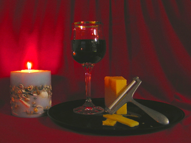
Contrast: in terms of luminesence, there is not a great deal of distance between the areas of the photo that most matter. Sure, the white points are white (reflections in the glasss), and the black points (the wine, pretty much) are at least nearly black, but I'm talking about the shadowing on the drape, the edging of the tray, and so on. It's these areas where the texture of your shot should most show, and that lack of range from dark to light removes a lot of that potential.
Light: what light there is seems very hard - the shadows from the glass and the edge of the tray are visible, yet you've not made a feature of them - especially that from the glass on the drape. It would repay more work, I'm sure: try lighting a subject with just a single desk lamp from the side and photographing it, and then try holding a piece of plain white paper over the desk lamp, and pay attention to the way the edges of the shadown change, and the lighting on the edges of the subject. Also this seems t have all the hallmarks of an underlit scene that's been over-brightened to get it all into a useful range: that lack of contrast, and the way the detail of the reds has disappeared. Some of that is no doubt due to exposing for the candle - but if you're going to shoot with a light source in shot then a lot more work is entailed to balance the lighting first: the bright point of that light source limits the range of correction available enormously.
Another impact of that low light is that the cheese has been made to look a very peculiar colour - it seems to me to have almost a green cast to it. A successful score with a shot like this dpends almost entirely on making things look appetising, and really that colour is quite off-putting.
Compositionally, there are two problems - the first being the candle, which disturbs the balance of the shot for me. Your title and comments almost give the truth away - referring only to the wine and the cheese, and never mentioning the candle. Why not? The brightness of that flame makes it the single thing that most draws the eye in the frame. I think it's presence is actively working against the rest of the image - it isn't necessary to add interest: without it you could have worked so much more succcessfully on the texture of the glass and the cheese and the drape.
It's a very vertical composition, posed this way. The candle is upright, the wine-glass naturally so, and even the cheese has been placed upright. The angling of the cheese-parer disrupts this, not necessarily in a bad way, but it confises matters. You have one very strong graphic element in that parer - both tonally and physically it has a very definite form, but the placing of the remainder of the objects doesn't do anything to complement that. Put the cheese on its side, move it a little further from the wine, and you'd have an echo of that overall shape of the parer that would give a much more eye-pleasing balance to the image. Also you've crropped very tightly to the subject (or perhaps, as it's so nearly a 4:3 aspect ratio, you've actually framed it that way in camera), which gives no breathing space for them.
Composition in these images is a tricky matter, and one not necessarily to be learnt from 'rules' - which can make it very intimidating to approach and learn about. If you think of the subjects and the areas of your photographs as having weight I find it helps - I mean all areas of a photograph, including those where there is 'nothing', because even if it's dead black or bright white there's still something there. One aim with a successful shot is to achieve some kind of balance within the frame - I don't mean by centrally placing your subject, as that tends (to follow this analogy) to give the impression of precariousness, to look like it might collapse at any moment. If you distribute the elements of your composition carefully throughout the frame, you'll find a point where you get the idea, looking at it, that there is an evenness throught the shot - that is you really turned those elements of the shot into weight, yoour photo wouldn't slip off your finger if you tried to balance it in the middle of the frame. This is why the rule of thirds works - that sense of balance: an image seems more 'stable' if the weight is taken away from one central point.
The reflection of the room in the glass here is also a distraction.
I hope this helps some. I write so much and in such detail firtly because you asked for an 'in-depth' critique (and I just received one that was unbelievably shallow), and because I think there is real potential in this shot and some of your other work that just isn't getting through.
Nice composition but this entry is plagued by lots of compression. Image is quite grainy. This is caused by high ISO settings or too much compression to fit file size in your photo-editing application. Most likely the first reason.