| Author | Thread |
|
|
09/18/2007 12:53:04 PM |
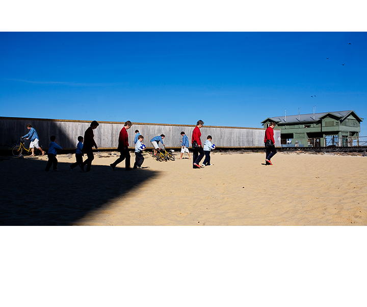
| I thought this was a very good capture of movement. Love the tones and the figures as they progress from the shadow to the sunlight. |
|
 Photographer found comment helpful. Photographer found comment helpful. |
|
|
09/11/2007 08:10:39 PM |
|
| Photographer found comment helpful. |
|
|
09/11/2007 08:09:44 PM |
| I was going to try one like this, but got distracted when the moon turned red. I am a bit of a doofus though, as I thought this looked like your work but didn't realize they were several shots, I thought you had found bizarro world. If I thought I could have voted on enough entries to have my vote count I would have given it a nice ten spot. |
|
| Photographer found comment helpful. |
Comments Made During the Challenge  |
|
|
09/07/2007 09:20:28 PM |
| What in the WORLD is going on with the white on the top and the bottom. |
|
| Photographer found comment helpful. |
|
|
09/06/2007 01:29:34 AM |
| I can see that there are only 3 people in the photo, and I find it very interesting, but I can't grasp the concept of asymmetric white space op top and the bottom... |
|
| Photographer found comment helpful. |
|
|
09/04/2007 08:29:41 PM |
| Nice documentation of time. It keeps me interested. |
|
| Photographer found comment helpful. |
|
|
09/04/2007 06:59:53 AM |
| I don´t know what to tell you, that extravagant frame is not to my taste and neither is that huge shadow in the left part of the photo. Also the multiplicity doesn´t really tell a story to me, sure it´s clever but it´s so easy to do and when I see it I want a sense of story, to me this is just some people walking and in pretty much the same posture and position in all places. It´s not bad though and way to go with experimenting, just take it to the next level next time :) |
|
| Photographer found comment helpful. |
|
|
09/03/2007 06:10:30 PM |
| Intresting editing but perhaps Im missing the why edit it like this, The white panorama style border is OK but with different heights is a bit funny to me. |
|
| Photographer found comment helpful. |
|
|
09/02/2007 02:49:55 PM |
this shadow and the bike is awfully familiar. where is that little fella, i guess he couldn't outrun this shadow :( this is really well-done nick, at first look i didn't realize i was watching a small episode from the life of these people. very cool- comment only.
|
|
| Photographer found comment helpful. |
|
|
09/02/2007 05:04:50 AM |
| I like this - good idea well executed in my opinion. |
|
| Photographer found comment helpful. |
|
|
09/02/2007 01:34:51 AM |
| Nice shot - Like the tones - Interesting use of the same subject - I think a better background with not so much of a contrast between shadow and highlight might have been better? Not too sure of the big white border. |
|
| Photographer found comment helpful. |
|
|
09/01/2007 08:37:48 PM |
| Flawless. Took me a few seconds to realise what I was looking at. My first thought was "so what, a few people on the sand". Very cool composite. The only thing that makes me wonder, is your choice of wide matting. Even if you had made the bottom same size as top?? Aesthetically, not sure it's helping you much here and it becomes a major distraction - for me anyways. Still like the image a lot though. |
|
| Photographer found comment helpful. |
|
|
09/01/2007 09:46:03 AM |
| Like the use of white borders. adds contrast to the blue :) |
|
| Photographer found comment helpful. |
|
|
09/01/2007 05:53:47 AM |
|
| Photographer found comment helpful. |
|
|
09/01/2007 12:41:30 AM |
| well done...clever editing |
|
| Photographer found comment helpful. |
Home -
Challenges -
Community -
League -
Photos -
Cameras -
Lenses -
Learn -
Help -
Terms of Use -
Privacy -
Top ^
DPChallenge, and website content and design, Copyright © 2001-2026 Challenging Technologies, LLC.
All digital photo copyrights belong to the photographers and may not be used without permission.
Current Server Time: 02/01/2026 10:55:52 AM EST.