| Author | Thread |
|
|
09/10/2007 11:28:38 AM |
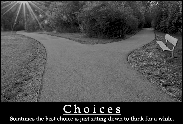
Yippee! I'm glad to get closer to the -6- range. Thanks to  posthumous for noting that the flare is an important symbol. I was also thinking of the light as a temptation. Sometimes we are drawn to that glorious/bright path when the better choice might be less well illuminated & clear. posthumous for noting that the flare is an important symbol. I was also thinking of the light as a temptation. Sometimes we are drawn to that glorious/bright path when the better choice might be less well illuminated & clear.
I also intend to follow up on many of the suggestions regarding font, lighting and  techo's idea to try keeping it in color. I am going to print this one for my classroom, so I want to refine it some more. techo's idea to try keeping it in color. I am going to print this one for my classroom, so I want to refine it some more.
Thanks All. |
|
|
|
09/10/2007 08:08:26 AM |
| the flare is an essential part of the picture (one path is lit, the other shaded, emphasizing that a choice must be made) and the grayness of it helps to emphasize the white text. this is a good poster. |
|
 Photographer found comment helpful. Photographer found comment helpful. |
|
|
09/10/2007 06:18:01 AM |
I was really hoping this would do better but congratulations on the new personal best! :)
I agree the shot needed a little contrast tweaking, some Shadow/Highlight tweaking... brightening up the shadows and bumping up the midtone contrast. The flare doesn't bother me, it could be seen as a feature of the shot, or not. It's like it signifies the spark of thought and ideas. Either way, the main composition is really good. Any chance you think it would've worked better in color? About the text, perhaps the bottom text being non boldish but of the same design would've looked more refined. But for the me the shot and the words that go with it are a big motivation. Sometimes we do have sit down and look at the world from the side, out of the stream of the fast life.
Message edited by author 2007-09-10 10:18:33. |
|
| Photographer found comment helpful. |
Comments Made During the Challenge  |
|
|
09/09/2007 07:45:04 PM |
| Indeed, this rings true. Excellent job with the capture and pairing the right words with it. |
|
| Photographer found comment helpful. |
|
|
09/09/2007 04:56:46 PM |
|
| Photographer found comment helpful. |
|
|
09/08/2007 10:08:04 PM |
| Interesting perspective, nice poster, light beams in the upper left are a little distracting. |
|
| Photographer found comment helpful. |
|
|
09/06/2007 12:00:30 PM |
|
| Photographer found comment helpful. |
|
|
09/06/2007 11:13:28 AM |
| Not overly fond of the sun flare and your B&W seems a bit dull and flat. Good choice of photo for this type of poster though |
|
| Photographer found comment helpful. |
|
|
09/06/2007 06:50:34 AM |
| Great image and perfect phrase! |
|
| Photographer found comment helpful. |
|
|
09/05/2007 08:04:45 PM |
| Terrific! Reminds me of advice for pilots, where emergencies are often made worse by rushing to the wrong action: Don't just do something, sit there! |
|
| Photographer found comment helpful. |
|
|
09/05/2007 08:28:03 AM |
| Great idea! without the title, it will still be a good photo, the bench really stands out after reading the title. |
|
| Photographer found comment helpful. |
|
|
09/03/2007 10:31:28 PM |
| Neat! Very motivational unlike the tons of "inspirational" I'm seeing instead. |
|
| Photographer found comment helpful. |
|
|
09/03/2007 08:39:45 PM |
| I like the idea and I like the execution. Great job. |
|
| Photographer found comment helpful. |
|
|
09/03/2007 06:47:59 PM |
|
| Photographer found comment helpful. |
|
|
09/03/2007 10:53:02 AM |
| Nice image and apt message- the lightspot adds so much to the take and its a nice poster to look at 8 |
|
| Photographer found comment helpful. |
|
|
09/03/2007 06:30:54 AM |
| This is a great idea! I think it could be improved with a less "muddy" image and a bit different typography. |
|
| Photographer found comment helpful. |
|
|
09/03/2007 03:32:06 AM |
|
| Photographer found comment helpful. |
|
|
09/03/2007 02:40:19 AM |
| nice shot, but lacking of contrast. good POV and composition. not sure about rays and the lens flare. typeface and layout look a little cheap. |
|
| Photographer found comment helpful. |
|
|
09/02/2007 10:01:33 PM |
| i like the way you have the rays on the left side of the picture. Nice job on this! |
|
| Photographer found comment helpful. |
Home -
Challenges -
Community -
League -
Photos -
Cameras -
Lenses -
Learn -
Help -
Terms of Use -
Privacy -
Top ^
DPChallenge, and website content and design, Copyright © 2001-2025 Challenging Technologies, LLC.
All digital photo copyrights belong to the photographers and may not be used without permission.
Current Server Time: 04/07/2025 01:21:15 AM EDT.