| Author | Thread |
|
|
09/15/2007 07:37:20 AM |
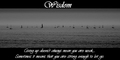
Critique Club feedback -
Good choice of imageto go along with your message.
Choice of font for the image itself is ok, though the key word could be much larger as really it is the 'point' of the poster. The color of the font isn't the best for this scene as part of the word blends into the photo beneath.
The photo is nice, but a bit on the soft side. |
|
 Photographer found comment helpful. Photographer found comment helpful. |
|
|
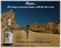
09/14/2007 08:14:31 AM |
| What a unique and lovely bookdrop! The things we get to see here - part of the reason I like this place. Very good illustration of your chosen "motivational saying", too. And how nicely appropriate to your new house situation! |
|
| Photographer found comment helpful. |
|
|
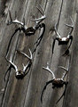
09/11/2007 01:25:21 PM |
| I like the very unique door/window. I haven't seen one quite like it. Nice little catch phrase to go with your theme. |
|
| Photographer found comment helpful. |
|
|
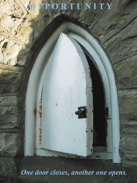
09/10/2007 07:15:47 AM |
I like this image a lot, and the message is good. The graphics are rather uninspiring, and I think that is what hurt your score.
P.S. I really like the way the stones, radiate from the top of the door. You might have been able to accentuate that effect in PP to make the open door really radiant.
Message edited by author 2007-09-10 11:18:24. |
|
| Photographer found comment helpful. |
Comments Made During the Challenge  |
|
|
09/09/2007 01:30:01 PM |
I think it's true .. Nice depiction of message..
WEll DoNE... |
|
| Photographer found comment helpful. |
|
|
09/08/2007 10:17:20 PM |
| Interesting subject, nice poster. Shadow is a little off putting. |
|
| Photographer found comment helpful. |
|
|
09/08/2007 03:03:07 AM |
| And the other door is where? |
|
| Photographer found comment helpful. |
|
|
09/06/2007 11:28:30 AM |
| Seems like you need more contract in this one. The font doesn't work for me but great idea. |
|
| Photographer found comment helpful. |
|
|
09/06/2007 11:00:21 AM |
| Good photo, might be better if your text was in the border and not on the photo itself, and not in that colour blue. |
|
| Photographer found comment helpful. |
|
|
09/06/2007 09:57:21 AM |
| I love the humor in this one, but not real keen on the lighting. I would have like to have seen more shadows (depth). |
|
| Photographer found comment helpful. |
|
|
09/05/2007 01:16:50 AM |
| what a strange door!i like the lightening as well |
|
| Photographer found comment helpful. |
|
|
09/04/2007 02:32:13 PM |
|
| Photographer found comment helpful. |
|
|
09/03/2007 05:36:39 PM |
| Good solid inspirational quote. The image could use a bit more contrast though and the O and P above gets lost in the background unfortunately. Maybe justifying right would have helped? |
|
| Photographer found comment helpful. |
|
|
09/03/2007 10:04:15 AM |
| Nice idea and photo. The 'O' in opportunity is too light for the background and might work better with a darker color, or offset to keep the whole word over the darker background |
|
| Photographer found comment helpful. |
|
|
09/03/2007 12:25:23 AM |
| The text is lost slightly at the top |
|
| Photographer found comment helpful. |
Home -
Challenges -
Community -
League -
Photos -
Cameras -
Lenses -
Learn -
Help -
Terms of Use -
Privacy -
Top ^
DPChallenge, and website content and design, Copyright © 2001-2025 Challenging Technologies, LLC.
All digital photo copyrights belong to the photographers and may not be used without permission.
Current Server Time: 04/07/2025 12:22:14 AM EDT.