| Author | Thread |
|
|
09/14/2007 03:24:25 PM |
Critique Club feedback:
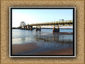
This is a very nice landscape and it works well in b/w. The range of tones is nice and the balance of the darkness below with the lights above works well. The overexposed bit of the sky doesn't work quite as well, and given the editing rules this might be a candidate for some selective masking to try and salvage that area if you are so inclined. Another thing to consider would be not splitting the image in half with the horizon, but rather emphasizing either the sky or the ground by lining the horizon up on the lower or upper third of the image.
Finally, looks like some sensor dust up near the top! Damnable dust bunnies.
Nice work! |
|
 Photographer found comment helpful. Photographer found comment helpful. |
Comments Made During the Challenge  |
|
|
09/06/2007 05:12:00 AM |
| Dark and brooding. A little too dark for me to see much. |
|
| Photographer found comment helpful. |
|
|
09/05/2007 11:52:44 AM |
| Interesting contrast of light and dark. |
|
| Photographer found comment helpful. |
|
|
09/02/2007 04:57:34 AM |
| My eyes are continually drawn to the white blown out area of the sky. I like the middle section where the light is hitting the valley. I am curious as to what this looks like in color. |
|
| Photographer found comment helpful. |
|
|
09/01/2007 10:45:42 PM |
| Nice shot - Like the tones - But PP has let this down as there is too much darkness with no detail in the foreground and it seems to lack sharpness. |
|
| Photographer found comment helpful. |
|
|
09/01/2007 01:45:29 AM |
|
| Photographer found comment helpful. |
Home -
Challenges -
Community -
League -
Photos -
Cameras -
Lenses -
Learn -
Help -
Terms of Use -
Privacy -
Top ^
DPChallenge, and website content and design, Copyright © 2001-2025 Challenging Technologies, LLC.
All digital photo copyrights belong to the photographers and may not be used without permission.
Current Server Time: 04/07/2025 11:09:50 AM EDT.