| Author | Thread |
Comments Made During the Challenge  |
|
|
08/28/2007 07:45:16 PM |
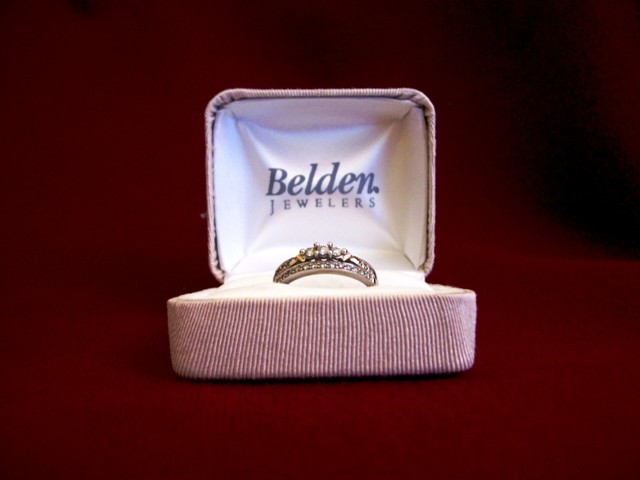
| Take a look at some of the other wedding ring entries. Putting it dead center and hiding most of it in the box really reduces the impact. Try different angles, different lighting, sometimes include shadows, etc. |
|
|
|
08/28/2007 03:07:39 AM |
| Feels a little too "straight on" also doesn't seem to be sitting level either. |
|
|
|
08/26/2007 08:11:25 AM |
| main subject a little oof |
|
|
|
08/23/2007 02:27:28 PM |
|
|
|
08/23/2007 02:26:22 PM |
| Nice idea & nice rings. Your shot is center composition and nicely lit. The focus, however, is not on the rings, but on the near edge of the ring box with its strong pink color and vertical lines. I think tilting the box forward would have put more focus on the rings and reduced the emphasis on the front of the box. |
|
|
|
08/22/2007 04:56:52 PM |
| I think that this would have been a better shot if you had taken it from a higher angle |
|
|
|
08/22/2007 07:23:47 AM |
| I think if there was an additional element of some sort (flower for example), your image would be more interesting..or maybe taken from a different angle. |
|
|
|
08/22/2007 02:10:53 AM |
| Good light, exposure and well centred. There is a dark area in the upper right of the background which is a distraction. |
|
Home -
Challenges -
Community -
League -
Photos -
Cameras -
Lenses -
Learn -
Help -
Terms of Use -
Privacy -
Top ^
DPChallenge, and website content and design, Copyright © 2001-2025 Challenging Technologies, LLC.
All digital photo copyrights belong to the photographers and may not be used without permission.
Current Server Time: 04/08/2025 03:13:57 AM EDT.