| Author | Thread |
Comments Made During the Challenge  |
|
|
01/31/2004 01:46:17 PM |
| Excellent idea. It seems a little lop sided. But it's great. |
|
 Photographer found comment helpful. Photographer found comment helpful. |
|
|
01/31/2004 01:20:30 AM |
| I think this would be nicer if the was in colour |
|
|
|
01/30/2004 11:01:18 AM |
Wow amazing photo!
a big 10 no doubt about that
this has to be in one of the top places looking forward to seing your pictures in the futer
Luv Mundi Pretty |
|
| Photographer found comment helpful. |
|
|
01/30/2004 10:59:08 AM |
| Yes this is interesting! I love how you play with the light here.. well done! Hope to see more of you in future challenges. |
|
| Photographer found comment helpful. |
|
|
01/30/2004 08:23:50 AM |
| Doesn't really interest me. |
|
|
|
01/29/2004 05:07:10 PM |
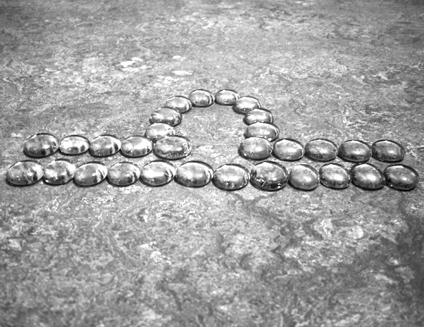
| interesting to hve the subject seem so like the background and yet it stands out, Are these clear glass pieces? You have chosen a horizontal composition, and yet the libra symbol is slightly tilted. It would be better with an obvious tilt, or esactly plumb. I'd crop on the top - having more space below the sign implies the weighing of objects unseen, and having th imbalance in the composition invites your eye to wander more. |
|
| Photographer found comment helpful. |
|
|
01/29/2004 10:39:40 AM |
| beautiful coloring and texture - 6 |
|
| Photographer found comment helpful. |
|
|
01/29/2004 09:30:15 AM |
| The background texture is a little distracting... otherwise a 7 |
|
| Photographer found comment helpful. |
|
|
01/29/2004 08:54:41 AM |
| I like this.....I just wish there would have been more contrast between the subject and the background.....just seems to blend in too much together......too gray and flat....just my opinion! |
|
| Photographer found comment helpful. |
|
|
01/28/2004 05:58:56 PM |
| i like burgers as well as burgeis |
|
| Photographer found comment helpful. |
|
|
01/28/2004 03:47:16 AM |
| let the jelly fish guide you to heaven |
|
|
|
01/28/2004 01:02:21 AM |
| The crop is a little off I think. A little too wide on the top and bottom and not enough on the sides. Great idea though. |
|
| Photographer found comment helpful. |
Home -
Challenges -
Community -
League -
Photos -
Cameras -
Lenses -
Learn -
Help -
Terms of Use -
Privacy -
Top ^
DPChallenge, and website content and design, Copyright © 2001-2026 Challenging Technologies, LLC.
All digital photo copyrights belong to the photographers and may not be used without permission.
Current Server Time: 02/01/2026 07:19:14 AM EST.