| Author | Thread |
|
|
08/22/2007 07:01:23 AM |
| Poor Shez. . .I wonder if people think this is slightly over-processed (tee hee. . .I just read thru the bajillion brutal opinions in that regard) Sorry you got beat up on this one. It's a lovely place!!! |
|
 Photographer found comment helpful. Photographer found comment helpful. |
|
|
08/21/2007 10:32:48 PM |
| Not on the last page......the comments should help you when processing landscapes. |
|
| Photographer found comment helpful. |
Comments Made During the Challenge  |
|
|
08/21/2007 07:01:29 PM |
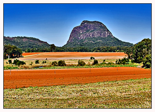
WOW~this is very colorful!! This shocked me when it popped up on the screen!
I like it, it's cool, 9. |
|
| Photographer found comment helpful. |
|
|
08/21/2007 02:45:48 PM |
| Post processing distracts ... especially the halo over the hils. Easy does it!! |
|
| Photographer found comment helpful. |
|
|
08/21/2007 01:23:09 PM |
| The sharpness added to this makes it unreal. Great location though. I would go back. |
|
| Photographer found comment helpful. |
|
|
08/20/2007 08:42:35 AM |
| over processed and too heavy on the saturation IMO. |
|
| Photographer found comment helpful. |
|
|
08/19/2007 06:18:19 AM |
|
| Photographer found comment helpful. |
|
|
08/18/2007 08:44:13 PM |
| Feels like the pic too heavily saturated and sharpened |
|
| Photographer found comment helpful. |
|
|
08/18/2007 08:39:29 PM |
| The oversaturation of the colours has overpowered what I think could have been a very nice scene imho. |
|
| Photographer found comment helpful. |
|
|
08/18/2007 02:36:31 PM |
| Nice, but to me the colors don't ring true. |
|
| Photographer found comment helpful. |
|
|
08/18/2007 11:13:17 AM |
| The saturation and oversharpening give this the look of a 1970s postcard. Don't know if that's what you intended but it's kinda interesting. |
|
| Photographer found comment helpful. |
|
|
08/17/2007 04:27:55 PM |
|
| Photographer found comment helpful. |
|
|
08/17/2007 04:52:16 AM |
| Way too much post-processing, distracts from the original image. |
|
| Photographer found comment helpful. |
|
|
08/17/2007 02:50:36 AM |
| Too much PP - the halo between hill and sky ruins what could have been a better shot. |
|
| Photographer found comment helpful. |
|
|
08/16/2007 02:30:16 PM |
| Over processed, over saturated, lots of posterization artifacts and halos. Sorry, but sometimes less is more. |
|
| Photographer found comment helpful. |
|
|
08/16/2007 02:05:24 PM |
| Love the colors and the mountain distortion like viewed through wavy glass. |
|
| Photographer found comment helpful. |
|
|
08/16/2007 12:53:05 AM |
| way overprocessed, too much use of shadows/highlights (probably), sharperning and noise rduction has created distracting halos, pixelated grass and oversoft trees. |
|
| Photographer found comment helpful. |
|
|
08/15/2007 08:03:23 PM |
| Interesting composition, just way overdone on the HDR. |
|
| Photographer found comment helpful. |
|
|
08/15/2007 06:54:18 PM |
|
| Photographer found comment helpful. |
|
|
08/15/2007 06:46:20 PM |
| Appears overly saturated and sharpened, but lovely landscape. |
|
| Photographer found comment helpful. |
|
|
08/15/2007 06:26:46 PM |
| The focus seems a too soft and the image too overprocessed... |
|
| Photographer found comment helpful. |
|
|
08/15/2007 05:50:16 PM |
| Something not quite right about this one, Im not sure if its too much sharpness or too much saturation. It would have been better otherwise. |
|
| Photographer found comment helpful. |
|
|
08/15/2007 03:36:25 PM |
| quite too much processing. |
|
| Photographer found comment helpful. |
|
|
08/15/2007 08:38:48 AM |
| extremely overprocessed in my opinion - the halo around the mountains/hills is very distracting |
|
| Photographer found comment helpful. |
|
|
08/15/2007 08:20:41 AM |
| oversaturated and hue is blown out picture seems not in focus |
|
| Photographer found comment helpful. |
|
|
08/15/2007 07:48:28 AM |
| This is a good shot however it looks over processed...It's hard to make out some of the detail... I'm curious to see what the original shot looks like. |
|
| Photographer found comment helpful. |
|
|
08/15/2007 12:20:30 AM |
| Wow...what did you do to your picture damn? It looks like you used photoshop way to much on the shadows and highlights you also over did the colors and if you sharpened it unsharpen it. At the same time I have to say its unique to the style of old postcard look I don't know I am confused on what to tell you. If your aim is for old style post cards that are supposed to look fake you hit it just right. |
|
| Photographer found comment helpful. |
|
|
08/14/2007 10:00:43 PM |
| Looks way over-processed. Lack of focus. |
|
| Photographer found comment helpful. |
|
|
08/14/2007 09:11:56 PM |
| Something wrong with this, too much sharpening has destroyed the natural look. It's way overdone. |
|
| Photographer found comment helpful. |
Home -
Challenges -
Community -
League -
Photos -
Cameras -
Lenses -
Learn -
Help -
Terms of Use -
Privacy -
Top ^
DPChallenge, and website content and design, Copyright © 2001-2025 Challenging Technologies, LLC.
All digital photo copyrights belong to the photographers and may not be used without permission.
Current Server Time: 04/07/2025 01:51:57 AM EDT.