| Author | Thread |
Comments Made During the Challenge  |
|
|
08/19/2007 07:55:58 PM |
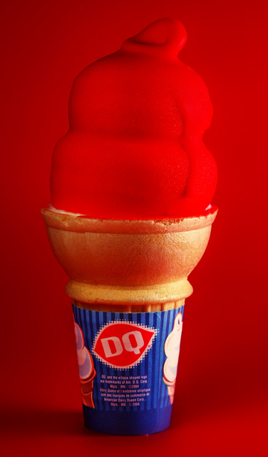
| A different background color would make your subject stand out; here it just disappears. |
|
 Photographer found comment helpful. Photographer found comment helpful. |
|
|
08/19/2007 01:58:29 PM |
What a weird effect. The red of the cone against the red of the background makes it look soft but the cone at the same distance looks sharp...
TC |
|
| Photographer found comment helpful. |
|
|
08/19/2007 12:58:09 PM |
| I like the red on red, it's very curious. I can see this as part of an add. ~7 |
|
| Photographer found comment helpful. |
|
|
08/19/2007 09:13:24 AM |
| Too much red, freaks me out. |
|
| Photographer found comment helpful. |
|
|
08/18/2007 08:35:54 PM |
| Interesting using the red on the red background. Pretty nice job lighting it to make the ice cream part stand out. |
|
| Photographer found comment helpful. |
|
|
08/18/2007 07:51:04 PM |
| Would have been more effective if the background weren't also red, or at least if it were a different red. As is, the cone just doesn't stand out enough. |
|
| Photographer found comment helpful. |
|
|
08/18/2007 05:33:18 PM |
| I think this image would be improved with a different colored background so the red color of the icecream would stand out more. |
|
| Photographer found comment helpful. |
|
|
08/18/2007 04:31:44 PM |
| whoa definitely needed a different background color. |
|
| Photographer found comment helpful. |
|
|
08/16/2007 12:05:05 PM |
| A bit harsh with red on red! But red is cool!! |
|
| Photographer found comment helpful. |
|
|
08/16/2007 08:37:44 AM |
| I think I would have liked this better with a different color background. |
|
| Photographer found comment helpful. |
|
|
08/15/2007 03:24:29 PM |
| Blends with the background too much, did you try white or other colors? |
|
| Photographer found comment helpful. |
|
|
08/15/2007 09:23:00 AM |
| should be red on white background...imho |
|
| Photographer found comment helpful. |
|
|
08/14/2007 06:54:49 PM |
| I am surprised you picked a red background instead of another color that would make the red cone pop out at us. |
|
| Photographer found comment helpful. |
|
|
08/14/2007 10:57:53 AM |
| might have been more effective with a different color background |
|
| Photographer found comment helpful. |
|
|
08/14/2007 10:41:58 AM |
| The question is, how long did you have before the lights melted the subject? I am not a fan of the red on red though, it just blends in, instead of putting all the focus on the subject. |
|
| Photographer found comment helpful. |
|
|
08/14/2007 10:11:06 AM |
| it feels like there is too much red to me...that the flavor gets lost. |
|
| Photographer found comment helpful. |
|
|
08/14/2007 09:14:21 AM |
| I don't think the red background helps you here, unfortunately. |
|
| Photographer found comment helpful. |
|
|
08/13/2007 05:56:12 PM |
| Very vibrant and red! I quite like it! |
|
| Photographer found comment helpful. |
|
|
08/13/2007 03:07:59 PM |
| a white b/g would've really made the red pop out. Here it just gets lost in the b/g. good try, 7 |
|
| Photographer found comment helpful. |
|
|
08/13/2007 02:58:52 PM |
| The red BG takes away from the image... |
|
| Photographer found comment helpful. |
|
|
08/13/2007 01:43:09 PM |
| This is a great idea in general. But it misses the boat in one crucial way. The cherry against the red background. Try it again sometime with a black or white background and see how much better it pops! |
|
| Photographer found comment helpful. |
|
|
08/13/2007 11:39:41 AM |
| I think I would have tried a different background colour to contrast the icecream. |
|
| Photographer found comment helpful. |
|
|
08/13/2007 08:30:09 AM |
| Wow! Now that's red! Maybe a bit too red. Also, I wonder hos this would look if you added an element or two to add interest, or a hairline border? |
|
| Photographer found comment helpful. |
|
|
08/13/2007 07:01:34 AM |
| The red background does not do the shot any service. |
|
| Photographer found comment helpful. |
|
|
08/12/2007 08:11:54 PM |
| The red background doesn't do the subject justice. Should have been different to make the red pop and stand out. |
|
| Photographer found comment helpful. |
Home -
Challenges -
Community -
League -
Photos -
Cameras -
Lenses -
Learn -
Help -
Terms of Use -
Privacy -
Top ^
DPChallenge, and website content and design, Copyright © 2001-2025 Challenging Technologies, LLC.
All digital photo copyrights belong to the photographers and may not be used without permission.
Current Server Time: 04/06/2025 10:47:35 PM EDT.