Greetings from the Critique Club!
I'll try to give you my first reaction on the photo, so here we go:
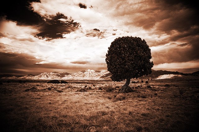
- I like the choice of monochromatic representation for the image.
- normally, I do not like when people overdo the vignetting, but this photo is an exception, and only because of the already crooked trunk of the tree. Combined with the vignette, it makes the whole image appear warped and sucks the viewer right into it
- the lightness range/balance between the center of the sky and the dark edges is a little bit too much for me. I would have preferred to find the range elsewhere, this way the sky in the center appears blown out.
For the free study challenge, I think that this image landed right where it was supposed to, given the fact that free studies on DPC typically attract more appealing images than a lonely tree landscapes. Nothing wrong with your image, I'm just saying that in this challenge, it fell right where I would have expected it to fall - upper 20% but not an award contender.
I hope this helps - and best of luck in future challenges.
-Serge |