| Author | Thread |
Comments Made During the Challenge  |
|
|
02/03/2004 05:50:50 PM |
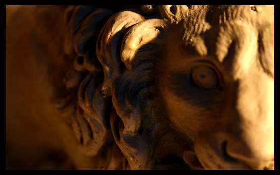
| Lighting and focus off. If these both had been better i'd think your composition and picture would be right on the money. |
|
|
|
02/03/2004 09:54:26 AM |
| Great DOF! Maybe just a little less shadow. =-) |
|
|
|
02/02/2004 09:25:16 PM |
|
|
|
02/02/2004 03:57:02 PM |
| The dof seems shallow. Interesting composition... |
|
|
|
02/02/2004 03:12:41 AM |
| Nice choice of subject, especially when only a portion of the detail is presented like this. Nice composition, nice use of shallow DOF. 8 |
|
|
|
01/31/2004 10:08:51 AM |
| i think the eye need to be in focus, rather then the maine |
|
|
|
01/29/2004 07:45:45 AM |
| I like the creative approach to shooting a static subject but image is so tight in frame that it is hard to recognize. |
|
|
|
01/29/2004 07:15:35 AM |
| I like how you cropped this one. And the lighting is beautiful. Great contrast. |
|
|
|
01/29/2004 04:24:41 AM |
| Shooting with very small apperture and narrow focus depth I think its very important what is put into focus and what out. In this subject I think it should have been the eye. |
|
|
|
01/29/2004 03:48:45 AM |
| I am not very fond of the lighting used here...the amount of light in the right front seems like too much, and the light source in the back does not seem like enough....just my opinion |
|
|
|
01/28/2004 07:27:36 PM |
| It looks like the focus wasn't on the eye, where it seems it should be. If it was on the eye it would be a much better picture. I like the way the lion is peeking into the frame with one eye. |
|
|
|
01/28/2004 01:37:05 PM |
| I would have preferred the focus on the eye. |
|
|
|
01/28/2004 09:40:57 AM |
|
|
|
01/28/2004 09:20:24 AM |
| Nice idea and composition, but the most important part of the shot, the statue's eye, is out of focus. Looks like the camera focussed on the edge of the mane instead. I would have rather seen the tip of the nose to the eye in focus with the rest blurred by the DOF. I like the lighting colour. I would have also cropped out more of that "dead space" on the left. |
|
|
|
01/28/2004 06:16:48 AM |
|
|
|
01/28/2004 06:09:38 AM |
| I like it - maybe if the focus was really on the eye it would pop a bit more though - it seems to be just behind that area |
|
|
|
01/28/2004 06:07:29 AM |
| Some more DOF will be great. Showing the lions face at focus too. |
|
|
|
01/28/2004 12:00:30 AM |
| Great shot - nice fee; but the sharp focus really needs to be on the eye. |
|
|
|
01/27/2004 09:53:24 PM |
| I like the way my eye is drawn to its' eye :) . Not sure if I'm too keen on the really shallow DOF though |
|
|
|
01/27/2004 08:20:06 PM |
|
|
|
01/27/2004 07:56:18 PM |
I think I would like it more if the focus was more on the eye. Nice crop though.
Whiskey |
|
Home -
Challenges -
Community -
League -
Photos -
Cameras -
Lenses -
Learn -
Help -
Terms of Use -
Privacy -
Top ^
DPChallenge, and website content and design, Copyright © 2001-2025 Challenging Technologies, LLC.
All digital photo copyrights belong to the photographers and may not be used without permission.
Current Server Time: 04/07/2025 12:47:53 PM EDT.