| Author | Thread |
|
|
02/10/2004 08:13:00 AM |
Greetings from the critique club.
I see you've already recieved a very detailed critique during the challenge. I pretty much agree.
This is a good idea and does meet the challenge.
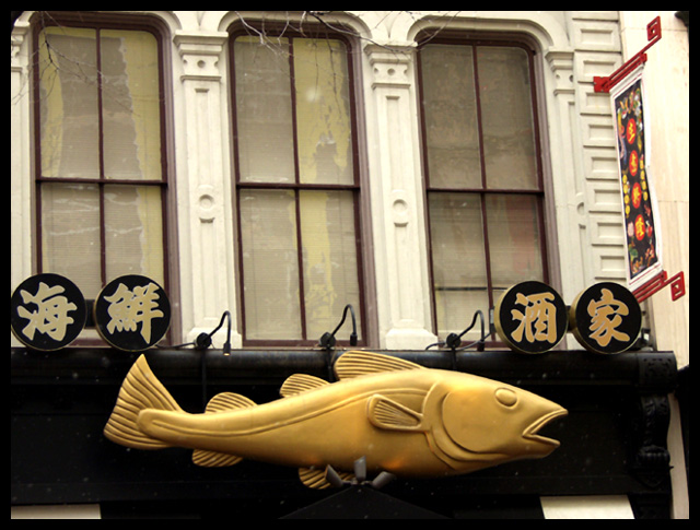
Because you are using existing light, it is just a bit flat. I see there are lights, possibly if you had waited until just dusk, it could have been more interesting. Just enough ambient light to outline the fish and the spots to create interest.
Rotating to even it out would be good, and a tighter crop to give it a panoramic feel would also probably help.
Hope this is of some assistance.
JC |
|
 Photographer found comment helpful. Photographer found comment helpful. |
Comments Made During the Challenge  |
|
|
01/31/2004 07:25:23 AM |
| Not appealing. border is distracting, out of focus (barely) |
|
|
|
01/31/2004 03:35:26 AM |
Good fish -
I found the picture very cluttered though and feel some of the problems could have been solved with judicous cropping and slight rotation.
There are a couple of ways of "treating this picture - Severely cropping it leaving just the fish and 2 of the chinese characters - or leaving it in its environment and careful cropping and a little rotation.
I find my eye is drawn to the tops of the windows. On the left the top of the frame has cut right into the window - on the right the frame is about six inches above the top of the window. Simply rotating the picture to get rid of that leaves the fish at an angle therefore that would be just as bad - but cropping to just below the window tops - and rotating just one or 2 degrees evens it out a lot.
Because the fish does appear dead straight to the bottom of the frame, I think the only way to fix this properly would have been to move your position slightly to the right (not always possible of course).
On the whole I think a simple crop - half-way across (just below the central window bars may have suited best.
David
|
|
| Photographer found comment helpful. |
|
|
01/28/2004 11:45:46 AM |
| Nice find. I think the bottom could use a tighter crop. The white from the awning is distracting. Good entry. |
|
| Photographer found comment helpful. |
|
|
01/28/2004 06:08:37 AM |
| Snapshot. Too many distractions. |
|
Home -
Challenges -
Community -
League -
Photos -
Cameras -
Lenses -
Learn -
Help -
Terms of Use -
Privacy -
Top ^
DPChallenge, and website content and design, Copyright © 2001-2025 Challenging Technologies, LLC.
All digital photo copyrights belong to the photographers and may not be used without permission.
Current Server Time: 04/07/2025 12:51:47 PM EDT.