| Author | Thread |
Comments Made During the Challenge  |
|
|
01/27/2004 06:34:07 PM |
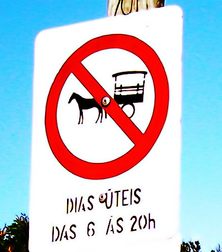
| I don't know if it happened in camera or in post but this is seriously over-saturated. Looks like what ever smoothing action or program you've used has also made the edges of the sign go completely fuzzy. Compositionally there just isn't much here. A straightforward shot of the sign from what appears to be from a typical adult viewpoint. The sign itself is certainly something you don't see every day. A more interesting angle, perhaps showing some of the surroundings, would improve the shot as well as reducing the over done processing. |
|
|
|
01/27/2004 11:38:24 AM |
| overexposed, boring compostition |
|
|
|
01/25/2004 05:35:45 PM |
| I like the posterisation, great image but needs more background detail for context |
|
|
|
01/25/2004 08:47:57 AM |
| I like the sign you chose; it is unique. The photo appears to be too saturated and over processed, though. |
|
|
|
01/21/2004 09:39:19 AM |
| A bit overly bright. Hurts my eyes. Good sign. |
|
|
|
01/21/2004 09:23:18 AM |
| the white on the sign seems overexposed. |
|
|
|
01/21/2004 07:41:36 AM |
| I bit too overexposed for me. |
|
|
|
01/21/2004 06:31:44 AM |
| A great original idea, but the focus and effects are a little strange, I'm not sure what you've done to it but it seems very fuzzy on the edges and a little too bright. Like the idea tho! |
|
|
|
01/21/2004 04:06:53 AM |
| A bit over exposed for me. Funny shot though! |
|
|
|
01/21/2004 03:51:59 AM |
| Colors look unnatural to me, mostly the reds, but, the blue looks a little off as well. That aside, great title for the shot. |
|
|
|
01/21/2004 12:10:06 AM |
| The sign seems overexposed |
|
Home -
Challenges -
Community -
League -
Photos -
Cameras -
Lenses -
Learn -
Help -
Terms of Use -
Privacy -
Top ^
DPChallenge, and website content and design, Copyright © 2001-2025 Challenging Technologies, LLC.
All digital photo copyrights belong to the photographers and may not be used without permission.
Current Server Time: 04/08/2025 01:29:36 AM EDT.