| Author | Thread |
|
|
01/26/2004 03:13:46 AM |
This is a good example of lighting. I am glad that you used the clone tool to cut the ceiling distractions. It looks much smoother and is easy on the eyes. Some of the photos you can tell that they took something out, but on this one I cannot tell! Great Job.
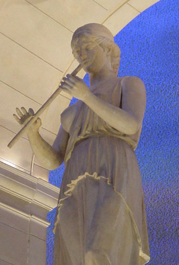
The blue background takes away from the photo. The eye wants to go towards the blue because it is the only color. Other than that, good job!
geschlechtmann27
Critique Club |
|
Comments Made During the Challenge  |
|
|
01/24/2004 12:15:30 PM |
The lighting on this looks a little dull and gives the shot a two dimensional feeling. I don't know where this is but if you were allowed to bring in more lighting from the sides it would help!
TC |
|
 Photographer found comment helpful. Photographer found comment helpful. |
|
|
01/21/2004 05:51:39 AM |
| This is a nice choice of statue, and the soft lighting and relatively plain background help to make the photo more than just a record of the sculptor's work. |
|
| Photographer found comment helpful. |
|
|
01/20/2004 12:46:15 AM |
| exposure and focus seem a touch off. |
|
|
|
01/19/2004 01:16:03 PM |
| I really enjoy your angle on this shot. There seems to be a little bit of noise in the shot, but it's not bad. I really enjoy the blue in contrast with the statue! |
|
|
|
01/19/2004 07:44:02 AM |
| That blue in the back is distracting, but nice overall. |
|
Home -
Challenges -
Community -
League -
Photos -
Cameras -
Lenses -
Learn -
Help -
Terms of Use -
Privacy -
Top ^
DPChallenge, and website content and design, Copyright © 2001-2025 Challenging Technologies, LLC.
All digital photo copyrights belong to the photographers and may not be used without permission.
Current Server Time: 04/07/2025 02:21:50 PM EDT.