| Author | Thread |
Comments Made During the Challenge  |
|
|
01/27/2004 11:56:27 PM |
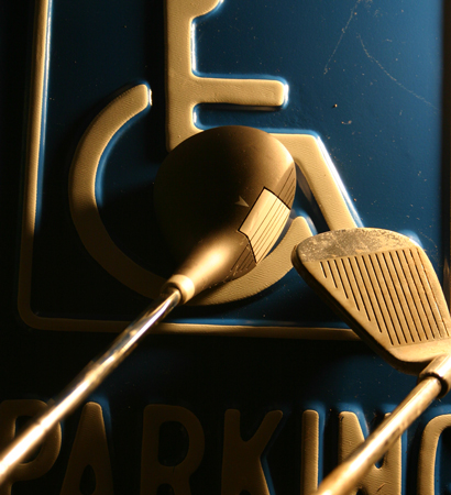
| It took me ages to figure out what you meant. Of course once I did it becomes all too obvious. The photo is nice and sharp but I think a little dark behind the clubs. I think also that removing the dirt and scratch marks would improve the photo. Creative and clever though. |
|
|
|
01/26/2004 03:37:06 AM |
| Don't get it. Kind of nice rythm to the photograph, though. |
|
|
|
01/25/2004 10:44:34 PM |
| I get the story but it doesn't seem to fit the challenge |
|
|
|
01/23/2004 10:52:45 PM |
| Interesting design, excellent color but it seems a little bizarre for this challenge... |
|
|
|
01/23/2004 04:45:55 PM |
| creative. as far as the picture goes, the whites seem just a bit on the yellow side. it's not really that much of an issue though. |
|
|
|
01/22/2004 11:10:47 AM |
| Being a golfer I really want to like this image, but I think it's just a tad bit too dark, especially in the lower left portion of the sign. |
|
|
|
01/21/2004 02:53:03 PM |
| absolutelly beautiful. Especially the colors. |
|
|
|
01/21/2004 02:24:24 PM |
| I like the golden tones and the dark blue of the sign, and also the slightly raised texture too. To be quite honest I have no idea what this is all about. I assume it's a disabled sign and what looks like golf clubs. I could guess that this is referencing a golf handicap but that's pretty far out there. Light and shadow is good, but the composition just looks like a chaotic mess to me, sorry. |
|
|
|
01/21/2004 09:42:39 AM |
| very nice tones here, a rich golden sepia, yet with a comanding blue still in the picture. i agree that this works best with a close crop, but maybe you came in a little too close on this one where the iron gets cut off. also, do we have to see the "parking" part of the sign? it kind of sends a mixed message at first becaue i think about driving, then golf. Perhaps the symbol alone with the clubs would work better? |
|
|
|
01/21/2004 08:51:53 AM |
| Took me a minute to get it, but i get it. Lighting on clubs interesting. |
|
|
|
01/21/2004 05:45:15 AM |
|
|
|
01/21/2004 03:09:33 AM |
|
|
|
01/21/2004 01:45:57 AM |
|
|
|
01/21/2004 01:21:18 AM |
| I'm not sure I understand the title or the gulf clubs placed over the handicap sign, could you please pm me and let me know what I'm missing...thanks. |
|
Home -
Challenges -
Community -
League -
Photos -
Cameras -
Lenses -
Learn -
Help -
Terms of Use -
Privacy -
Top ^
DPChallenge, and website content and design, Copyright © 2001-2026 Challenging Technologies, LLC.
All digital photo copyrights belong to the photographers and may not be used without permission.
Current Server Time: 02/01/2026 10:07:47 AM EST.