| Author | Thread |
|
|
07/25/2007 04:41:40 AM |
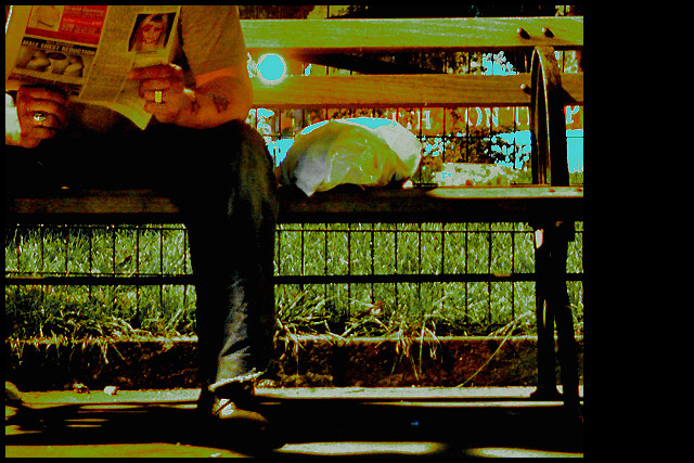
| This was a night shot so the coloring wasn't that off ;) Though the wb could have been set tungsten to lose the red glare. Yes it was a bit noisy to bring out some of the shadows and the whites did get a bit altered to tone down the bright light. i thought more people would comment on the photo sliding off the frame. i feel good knowing a gave people comfort in their own work to bash this ;) i'm sad i got this close to the brown but couldn't quite pull it off. |
|
Comments Made During the Challenge  |
|
|
07/24/2007 01:27:33 PM |
| I suspect this will be underrated, as it is so different. I find it quite artistic, however. I really like the odd green tonal choices. The only distracting element is the blue circle next to the guy's arm. |
|
|
|
07/24/2007 11:07:36 AM |
| Interesting concept. The super blown-out spot in the top center by the subjects left forearm really grabs the eye and detracts. |
|
|
|
07/24/2007 06:24:49 AM |
|
|
|
07/23/2007 07:00:41 AM |
| A little over-edited in my opinion. Nice concept though |
|
|
|
07/22/2007 08:12:30 PM |
| Interesting PP effect on this. |
|
|
|
07/21/2007 06:37:42 PM |
| There is a lot going on in this shot....the reflection is a bit too distracting for me. |
|
|
|
07/21/2007 12:22:02 PM |
| Great idea but the photo seems blown out. |
|
|
|
07/20/2007 09:09:33 AM |
| interesting subject matter! |
|
|
|
07/20/2007 06:04:47 AM |
| personally, I don't care for the processing on this shot ... I think it would be more effective in b/w |
|
|
|
07/20/2007 04:32:01 AM |
| the composition is strong, but other items take it out of strength for me. The bright blue spot, the strong shadows, the fight for visual attention that is going on with the lettering, over saturated blues, the lettering behind the fence, the large black post and the sack on the bench. |
|
|
|
07/19/2007 11:24:02 PM |
| I'm not very keen on the noisy saturated false colouring. |
|
|
|
07/19/2007 07:17:30 PM |
|
|
|
07/19/2007 01:40:39 PM |
|
|
|
07/19/2007 12:39:38 PM |
| i don't really like the grainyness of this |
|
|
|
07/18/2007 06:12:11 PM |
| This is kind of creepy. I'm going to act like I didn't see this one. |
|
|
|
07/18/2007 11:39:59 AM |
| Sorry, but the point is unclear from the title (yes, I see the newspaper.) The editing skills need a lot of practice. 2 |
|
|
|
07/18/2007 05:36:10 AM |
| I love the feel of this, it's a little over processed for my taste. |
|
|
|
07/17/2007 08:33:05 PM |
| im not sure what the big black neg space has to do with anything. and the "pop art" effect dosent add to the photo. |
|
|
|
07/17/2007 08:15:35 PM |
|
Home -
Challenges -
Community -
League -
Photos -
Cameras -
Lenses -
Learn -
Help -
Terms of Use -
Privacy -
Top ^
DPChallenge, and website content and design, Copyright © 2001-2025 Challenging Technologies, LLC.
All digital photo copyrights belong to the photographers and may not be used without permission.
Current Server Time: 04/07/2025 01:02:28 AM EDT.