| Author | Thread |
Comments Made During the Challenge  |
|
|
01/27/2004 11:31:14 AM |
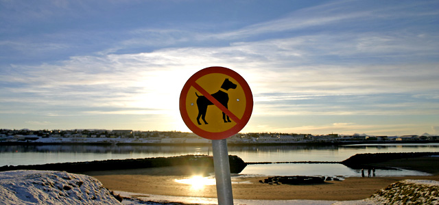
| the sign shold NOT be inthe center of the pic! otherwise, very nice |
|
|
|
01/25/2004 10:10:58 PM |
| It said 'enter my comment' and the first thing that came to mind was how unfair life can be for pets. But, my other comments are thtat it's a lovely shot a little spoiled by the glare of the reflection of the sun. |
|
|
|
01/25/2004 05:46:46 PM |
| A beautiful scene, the sun flare fights with the sign for the eye, half a step to the right might have helped and also taken the sign out of dead centre. |
|
|
|
01/25/2004 02:38:32 PM |
| I would have preferred this with the sign off-centre. I like the choice of scene and those tiny people near the water. |
|
|
|
01/25/2004 01:04:05 PM |
| Nice shot, though I would have preferred to have seen the sign not quite so centered. 7 |
|
|
|
01/25/2004 08:12:06 AM |
| nice pic shame about the sign |
|
|
|
01/24/2004 04:16:13 AM |
| Nice shot, next time use the sign pole to block out that glare spot. |
|
|
|
01/22/2004 03:26:45 PM |
| Nice colors. I would have not put the sign dead center. Mayb try a few different angles with the sun on water. |
|
|
|
01/22/2004 01:25:55 PM |
| There is something about that sign right in the middle of the picture that just doesn�t seem to work for me. Clean clear photo though. |
|
|
|
01/22/2004 06:13:29 AM |
| Poor poochies! It loks like alovely place. Having the sign dead center really adds to the feeling of being forbidden - even keeps the viewer from seeing the whole scene. Works thematically. Wish there were more light onthe sign - a brighter flas (it looks like you has some flash on it) Its just that with the brigh reflection of the sun in the water you get distracted from the sign. |
|
|
|
01/21/2004 06:28:07 PM |
| Good landscape! Not particularly fond of the sign being dead in the center of the photo. Also too bad that the sign is a little crooked (not your fault, however). It would have been so cool if there was a dog in the background, that would have been funny. =-) Still a nice photo! |
|
|
|
01/21/2004 12:12:11 PM |
| nicely exposed in such tough conditions |
|
|
|
01/21/2004 11:22:10 AM |
| I wonder if the dogs understand that sign? |
|
|
|
01/21/2004 07:40:43 AM |
| I would have liked the sign positioned either further left or right in the frame. I know it waan exposure challenge to do so. |
|
 Photographer found comment helpful. Photographer found comment helpful. |
|
|
01/21/2004 07:27:05 AM |
| This is a lovely sky and a beautiful landscape. IMHO the sign should be off to one side so as not to break up the landscape shot. If it were on the left, the dog would appear to be looking into the scene, which would be very effective. |
|
| Photographer found comment helpful. |
|
|
01/21/2004 06:53:09 AM |
| good job! just wish the sign had a little more light on it, but thats almost impossible if you want to capture that beautiful sky too! |
|
| Photographer found comment helpful. |
|
|
01/21/2004 06:22:30 AM |
| Nice background, hot spot detracts a bit |
|
|
|
01/21/2004 04:08:32 AM |
| I think the sun glare robs the focal point of this shot. |
|
|
|
01/21/2004 02:04:10 AM |
| Glare is very distracting. Not sure I see this as a "road sign". |
|
|
|
01/21/2004 01:02:56 AM |
| I think the tilted sign spoils it a bit, though not much you could have done about it! |
|
Home -
Challenges -
Community -
League -
Photos -
Cameras -
Lenses -
Learn -
Help -
Terms of Use -
Privacy -
Top ^
DPChallenge, and website content and design, Copyright © 2001-2025 Challenging Technologies, LLC.
All digital photo copyrights belong to the photographers and may not be used without permission.
Current Server Time: 04/07/2025 01:25:59 AM EDT.