| Author | Thread |
Comments Made During the Challenge  |
|
|
09/14/2002 09:43:00 AM |
| Background needs to be unified. |
|
|
|
09/13/2002 02:00:00 PM |
| woah, that is interesting looking! |
|
|
|
09/13/2002 10:23:00 AM |
| The lighting on this gives it a nice cheerful feeling, I think. Did you try different angle perspectives (lower, etc.)? karmat |
|
|
|
09/13/2002 01:12:00 AM |
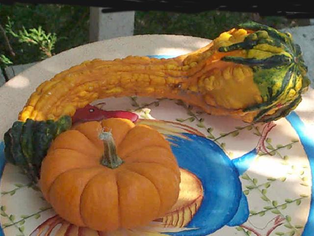
The fruit have all the colour and texture needed. The colourful plate really distracts from that. I'd shoot them on a plain white or other neutral colour background to really focus on their shape and beauty.
Kavey |
|
|
|
09/12/2002 05:01:00 PM |
| very good compostion, but I think more even lighting would improve the image, as well as pumping up the contrast and the saturation. The colors work well together, but what is the black stuff at the top? It looks like magic marker. |
|
|
|
09/11/2002 09:33:00 AM |
| This is a good attempt by the photographer, but I have some suggestions: Next time, use a simpler plate. The textures and patterns on the veggies, combined with that pretty and fancy plate makes the shot WAY too busy. The eye doesn't know where to look! |
|
|
|
09/11/2002 07:16:00 AM |
| lighting's nice, subject isn't. |
|
|
|
09/10/2002 04:32:00 PM |
| The fancy plate detracts from the shape of the vegetables. |
|
|
|
09/09/2002 08:35:00 PM |
| I had a hard time trying to decide how to rate this shot. I'm trying to think about how I might have don this differently. I think I would have tried different combinations of arranging the items, or perhaps a close up of the textures these items provide. One step further perhaps a close up of the shadows of the textures. |
|
|
|
09/09/2002 04:30:00 PM |
Composition: Subject Placement, Cropping, Background7,
Technical: Focus, Exposure, Lighting, Processing7,
Appeal: Is it Interesting, Motivating, Etc.? 9,
Total Averaged Rating8. Autool
|
|
|
|
09/09/2002 03:48:00 PM |
| did you consider using a dish with less pattern? perhaps a solid color would have provided a better background for the colorful and rough textured things you used. |
|
|
|
09/09/2002 12:27:00 PM |
| This is a pretty nice shot, but the shadows darken your subjects a bit too much. Sun and shadows in the same shot are always difficult. 7 Swash |
|
Home -
Challenges -
Community -
League -
Photos -
Cameras -
Lenses -
Learn -
Help -
Terms of Use -
Privacy -
Top ^
DPChallenge, and website content and design, Copyright © 2001-2025 Challenging Technologies, LLC.
All digital photo copyrights belong to the photographers and may not be used without permission.
Current Server Time: 04/09/2025 02:48:36 AM EDT.